Flutter设置TabBar indicator宽度(爆改UnderlineTabIndicator )
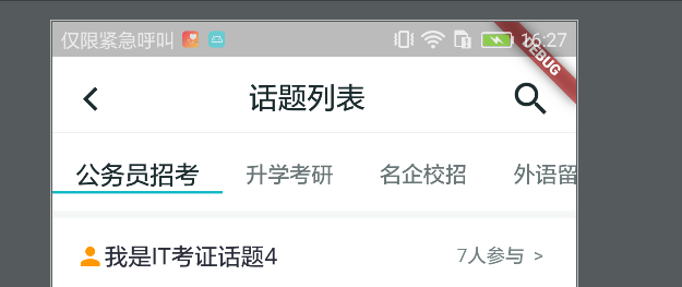
在默认的TabBar中,indicator的宽度是不可以修改的,每个长度都是平分一个Item的,如下图:
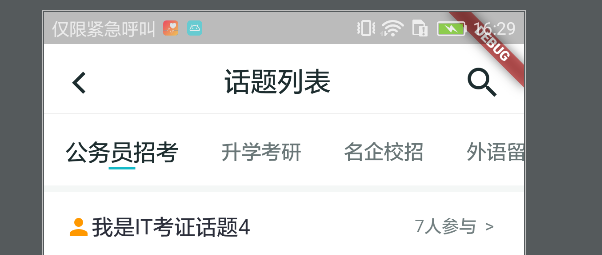
这个是未修改的图,下面是修改的图,总的宽度为20
总的在源码里翻来翻去,发现并没有可以设置Indicator的字段,这时候,尝试着通过源码来修改indicator的宽度,同时也是借助了这篇文章,不过,给的有些随意,故在这记录之。
源码探索:
点进TabBar的源码
const TabBar({Key key,@required this.tabs,this.controller,this.isScrollable = false,this.indicatorColor,this.indicatorWeight = 2.0,this.indicatorPadding = EdgeInsets.zero,this.indicator, //这是我们要修改的indicatorthis.indicatorSize,this.labelColor,this.labelStyle,this.labelPadding,this.unselectedLabelColor,this.unselectedLabelStyle,this.dragStartBehavior = DragStartBehavior.start,this.onTap,}) : assert(tabs != null),assert(isScrollable != null),assert(dragStartBehavior != null),assert(indicator != null || (indicatorWeight != null && indicatorWeight > 0.0)),assert(indicator != null || (indicatorPadding != null)),super(key: key);
再点进去indicator的源码,发现了有一个默认的UnderlineTabIndicator。
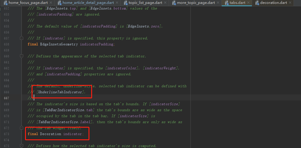
这时候我们再点进去默认的UnderlineTabIndicator,看下是否有进行修改宽度的地方。
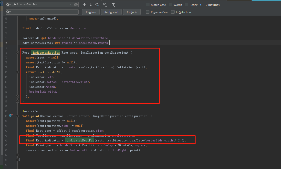
刚好,我们看到了一个print输出,输出的是一个Rect,这个可能恰好是我们说要修改的。
修改:
这时候我们将整个UnderlineTabIndicatorcopy过来,重命名为MyUnderlineTabIndicator,为了避免与官方相冲突。再对上面截图的地方进行修改,下面是总的源码
my_underline_indicator.dart
// Copyright 2018 The Chromium Authors. All rights reserved.// Use of this source code is governed by a BSD-style license that can be// found in the LICENSE file.import 'package:flutter/material.dart';import 'package:flutter/widgets.dart';/// Used with [TabBar.indicator] to draw a horizontal line below the/// selected tab.////// The selected tab underline is inset from the tab's boundary by [insets]./// The [borderSide] defines the line's color and weight.////// The [TabBar.indicatorSize] property can be used to define the indicator's/// bounds in terms of its (centered) widget with [TabIndicatorSize.label],/// or the entire tab with [TabIndicatorSize.tab].class MyUnderlineTabIndicator extends Decoration {/// Create an underline style selected tab indicator.////// The [borderSide] and [insets] arguments must not be null.const MyUnderlineTabIndicator({this.borderSide = const BorderSide(width: 2.0, color: Colors.white),this.insets = EdgeInsets.zero,}) : assert(borderSide != null),assert(insets != null);/// The color and weight of the horizontal line drawn below the selected tab.final BorderSide borderSide;/// Locates the selected tab's underline relative to the tab's boundary.////// The [TabBar.indicatorSize] property can be used to define the/// tab indicator's bounds in terms of its (centered) tab widget with/// [TabIndicatorSize.label], or the entire tab with [TabIndicatorSize.tab].final EdgeInsetsGeometry insets;@overrideDecoration lerpFrom(Decoration a, double t) {if (a is UnderlineTabIndicator) {return UnderlineTabIndicator(borderSide: BorderSide.lerp(a.borderSide, borderSide, t),insets: EdgeInsetsGeometry.lerp(a.insets, insets, t),);}return super.lerpFrom(a, t);}@overrideDecoration lerpTo(Decoration b, double t) {if (b is MyUnderlineTabIndicator) {return MyUnderlineTabIndicator(borderSide: BorderSide.lerp(borderSide, b.borderSide, t),insets: EdgeInsetsGeometry.lerp(insets, b.insets, t),);}return super.lerpTo(b, t);}@override_MyUnderlinePainter createBoxPainter([ VoidCallback onChanged ]) {return _MyUnderlinePainter(this, onChanged);}}class _MyUnderlinePainter extends BoxPainter {_MyUnderlinePainter(this.decoration, VoidCallback onChanged): assert(decoration != null),super(onChanged);final MyUnderlineTabIndicator decoration;BorderSide get borderSide => decoration.borderSide;EdgeInsetsGeometry get insets => decoration.insets;Rect _indicatorRectFor(Rect rect, TextDirection textDirection) {assert(rect != null);assert(textDirection != null);final Rect indicator = insets.resolve(textDirection).deflateRect(rect);//希望的宽度double wantWidth = 20;//取中间坐标double cw = (indicator.left + indicator.right) / 2;return Rect.fromLTWH(cw - wantWidth / 2,indicator.bottom - borderSide.width, wantWidth, borderSide.width);}@overridevoid paint(Canvas canvas, Offset offset, ImageConfiguration configuration) {assert(configuration != null);assert(configuration.size != null);final Rect rect = offset & configuration.size;final TextDirection textDirection = configuration.textDirection;final Rect indicator = _indicatorRectFor(rect, textDirection).deflate(borderSide.width / 2.0);final Paint paint = borderSide.toPaint()..strokeCap = StrokeCap.square;canvas.drawLine(indicator.bottomLeft, indicator.bottomRight, paint);}}
使用:
Container(height: 46,child: TabBar(indicatorColor: MyColorRes.primaryColor,labelColor: MyColorRes.tvMainSelectColor,unselectedLabelColor: MyColorRes.tvMainUnSelectColor,unselectedLabelStyle: TextStyle(fontSize: 15),labelStyle: TextStyle(fontSize: 17),isScrollable: true,indicator: MyUnderlineTabIndicator(borderSide: BorderSide(width: 2.0, color: MyColorRes.primaryColor)),controller: _tabController,tabs: mTabs.map((value) {return Text(value.name);}).toList(),),alignment: Alignment.centerLeft,color: MyColorRes.bg_white,),


 淩亂°似流年
 以你之姓@
以你之姓@ 系统管理员
系统管理员 左手的ㄟ右手
 ╰+攻爆jí腚メ
 超、凢脫俗
超、凢脫俗 我会带着你远行
")


还没有评论,来说两句吧...