CSS布局入门--应用Block Formatting Context
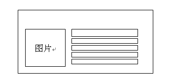
如何实现一个左图右内容的显示效果,写出html和css(见下图)。
方案1
1 <table>2 <tr>3 <td valign="top" class="imgtd">4 <a ...><img ...></a>5 </td>6 <td valign="top">...</td>7 </tr>8 </table>
html结构丑陋,但css简单。
方案2
1 <div class="twit_item MIB_linedot2">2 <div class="twit_item_pic">3 <a href="" target="_blank">4 <img src="" ...>5 </a>6 </div>7 <div class="twit_item_content">8 ....9 </div>10 </div>
css实现:
1 .twit_list dd .twit_item_pic{float:left;width:66px;padding-top:2px;}2 .twit_list dd .twit_item_content{float:left;width:316px;color:#666;line-height:18px;}
用了浮动就必须定宽,结构就失去灵活性,同时必须解决浮动带来的一系列问题。
方案3 网易首页 新闻
1 <div class="imgText-temp-1 dotline clearfix">2 <div class="mod-img main-img">3 <a href=""><img src="" ...></a>4 </div>5 <ul class="mod-list main-list">6 <li>...</li>7 <li>...</li>8 <li>...</li>9 <li>...</li>10 </ul>11 </div>
css实现:
1 .imgText-temp-1 { overflow:hidden;padding-left:132px;margin-bottom:3px; }2 .imgText-temp-1 .main-img { position:absolute;_display:inline;margin-left:-132px; }
在容器左侧挤出一个132px的空白,再让.main-img定位为absolute,再向左移132px。
如果理解block formatting context(块级格式化上下文)的概念, 就不会这么写了。触发了BFC的块级元素,它的边缘不会和float box重叠。所以可以写成:
方案4
1 <div class="item">2 <div class="pic">...</div>3 <div class="content">...</div>4 </div>
css实现:
1 .item .pic { float:left;margin-right:10px; }2 .item .content { overflow:hidden;zoom:1; } /* 或用display:table-cell */
通过方案4实现
1 <!DOCTYPE HTML>2 <html lang="zh-CN">3 <head>4 <title></title>5 </style>6 </head>7 <body>8 <div class="mod">9 <h2>新闻</h2>10 <div class="list">11 <ul>12 <li>13 <div class="item">14 <div class="pic">15 <a href=" "><img width="120" height="90" title=" " alt=" " src=" "></a>16 </div>17 <div class="info">18 <h3 class="title"><a href=" "</a>19 <a href=" "> </a>20 </h3>21 <ul >22 <li><a href=" "> </a></li>23 <li><a href=" "> </a></li>24 <li><a href=" "> </a></li>25 <li><a href=" "> </a></li>26 </ul>27 </div>28 </div>29 </li>30 </ul>31 </div>32 </div>33 </body>34 </html>
CSS**实现**
1 body { width:800px;margin:1em auto;font:12px/1.5 arial,sans-serif; }2 ul,h3{ margin:0;padding:0; }3 h2 { margin:0;padding:0; }4 li { list-style:none; }5 img { border:none; }6 a:link { text-decoration:none; }78 /*----------------------------------------------*/9 .mod { border:1px solid red; }10 .list { letter-spacing:-0.31em;*letter-spacing:normal;word-spacing:-0.43em; }11 .list{ display:inline-block;*display:inline;zoom:1;width:50%;margin-top:10px;vertical-align:top;word-spacing:normal;letter-spacing:normal; }12 .item li { display:block;width:auto;margin:auto; }13 .item { overflow:hidden; }14 .item .pic { float:left;margin-right:10px; }15 .item .info { overflow:hidden;zoom:1; }
DEMO:
Block Formatting Context
简单地说,Block Formatting Context就是页面上的一个隔离的独立容器,容器里面的子元素不会在布局上影响到外面的元素,反之也是如此。不是所有的元素都会建立一个“Block Formatting Context“。只要符合条件,任何块级元素都建立一个新的”Block Formatting Context”, 一个” Block Formatting Context”至少满足以下条件之一。
float:left
float:right
position:absolute
display:inline-block
display:inline-table
display:table-cell
display:table
overflow:auto
overflow:scroll
overflow:hidden(也就是除了overflow:visible;)
Block Formatting Context在文档流中属于正常流。也就是说,它跟块级模型、inline模型、盒模型的relative position、还有run in盒模型一样,属于页面文档流。
ps.与正常页面文档流相对应的,还有浮动和绝对定位(fixed是absolute的一个子集)。
Block Formatting Context**有什么用?**
1.**可以阻止边距折叠(margin collapsing**)。
一般情况下,两个上下相邻的盒子会折叠它们垂直方向接触到的边距,这种情况只会发生在同一个Block Formatting Context中。换句话说,在同一个布局环境中(Block Formatting Context)是边距折叠的必要条件。这也就是为什么浮动的元素和绝对定位元素不会发生边距折叠的原因(当然还有很多种情况也不会折叠)。
2.Block Formatting Context**可以包含内部元素的浮动**
请run一下如下代码:
- 1 <!DOCTYPE html>
2
3
4
5Demo
6
12
13
14
17
18two
19
20
21
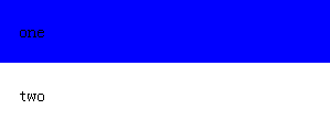
上面两个同样的DIV,设置了背景色为蓝色,但后一个DIV的背景颜色没有显示出来,为内部的浮动元素脱离了文档流,不受父元素的控制,那么父元素在文档流中是一个空标签,没有高度和宽度,也就不显示任何颜色;而第二个div由于生成了Block Formatting Context(通过overflow:hidden;触发)会包容住里面的浮动元素,这样容器才会有自己的宽度和高度(被子元素撑开),这样就会显示出颜色。
3.Block Formatting Context**可以阻止元素覆盖浮动盒模型**
Block Formatting Context的盒模型(见BOX)border外延(而不是margin外延,也就是说无视margin设置)不会覆盖周围的浮动盒模型margin外延。这就是说浏览器应该默默创建一个特定边距来阻止Block Formatting Context的盒模型border外延覆盖周围的浮动盒模型。出于此种原因,接在浮动元素后面的Block Formatting Context上设置的负边距应该是无效的(应该被浏览器默默创建的特定边距覆盖)。webkit和IE会有所不同。
BOX
一个盒包括了内容(content)、边框(border)、内边距(padding)、外边距(margin)。下图展示了盒模型的直观意义:
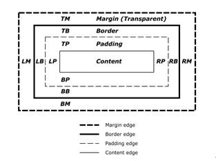
盒的尺寸(width与height)定义受到box-sizing属性的影响。box-sizing可选择content-box(默认), padding-box和border-box三种模式。
附:DEMO代码
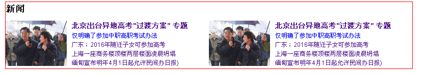
1 <!DOCTYPE HTML>2 <html lang="zh-CN">3 <head>4 <meta charset="UTF-8">5 <title></title>67 <style type="text/css">8 body {width:800px;margin:1em auto;font:12px/1.5 arial,sans-serif; }9 ul,h3{margin:0;padding:0; }10 h2 {margin:0;padding:0; }11 li {list-style:none; }12 img {border:none; }13 a:link {text-decoration:none; }1415 /*----------------------------------------------*/16 .mod {border:1px solid red; }1718 .list {letter-spacing:-0.31em;*letter-spacing:normal;word-spacing:-0.43em; }19 .list li {display:inline-block;*display:inline;zoom:1;width:50%;margin-top:10px;vertical-align:top;word-spacing:normal;letter-spacing:normal; }20 .item li {display:block;width:auto;margin:auto; }2122 .item {overflow:hidden; }23 .item .pic {float:left;margin-right:10px; }24 .item .info {overflow:hidden;zoom:1; }25 </style>26 </head>27 <body>282930 <div class="mod">31 <h2>新闻</h2>32 <div class="list">33 <ul>34 <li>35 <div class="item">36 <div class="pic">37 <a href="http://news.163.com/photoview/00AN0001/30649.html"><img width="120" height="90" title="胡JT为村书记称伞" alt="胡JT为村书记称伞" src="http://img5.cache.netease.com/cnews/2012/12/30/20121230073119fd303.jpg"></a>38 </div>39 <div class="info">40 <h3 class="title"><a href="http://news.163.com/special/ydgk/">北京出台异地高考"过渡方案"</a>41 <a href="http://news.163.com/special/ydgk">专题</a>42 </h3>4344 <ul >45 <li><a href="http://news.163.com/12/1230/13/8JVORTG90001124J.html">仅明确了参加中职高职考试办法 </a></li>46 <li><a href="http://news.163.com/12/1230/12/8JVLIE190001124J.html">广东:2016年随迁子女可参加高考</a></li>47 <li><a href="http://news.163.com/12/1230/08/8JV986AK0001124J.html">上海一座商务楼顶楼两层楼面凌晨坍塌</a></li>48 <li><a href="http://news.163.com/12/1230/06/8JV171JM0001121M.html">缅甸宣布明年4月1日起允许民间办日报)</a></li>49 </ul>50 </div>51 </div>52 </li>5354 <li>55 <div class="item">56 <div class="pic">57 <a href="http://news.163.com/photoview/3R710001/18312.html"><img width="120" height="90" title="胡JT为村书记称伞" alt"胡JT为村书记称伞" src="http://img5.cache.netease.com/cnews/2012/12/30/20121230073119fd303.jpg"></a>58 </div>59 <div class="info">60 <h3 class="title"><a href="http://news.163.com/special/ydgk/">北京出台异地高考"过渡方案"</a>61 <a href="http://news.163.com/special/ydgk">专题</a>62 </h3>6364 <ul >65 <li><a href="http://news.163.com/12/1230/13/8JVORTG90001124J.html">仅明确了参加中职高职考试办法 </a></li>66 <li><a href="http://news.163.com/12/1230/12/8JVLIE190001124J.html">广东:2016年随迁子女可参加高考</a></li>67 <li><a href="http://news.163.com/12/1230/08/8JV986AK0001124J.html">上海一座商务楼顶楼两层楼面凌晨坍塌</a></li>68 <li><a href="http://news.163.com/12/1230/06/8JV171JM0001121M.html">缅甸宣布明年4月1日起允许民间办日报)</a></li>69 </ul>70 </div>71 </div>72 </li>7374 </ul>75 </div>767778 </div>7980 </body>81 </html>
转载于 //www.cnblogs.com/lefan/archive/2012/12/30/2839935.html


 偏执的太偏执、
 小鱼儿
小鱼儿 小灰灰
小灰灰 灰太狼
灰太狼 左手的ㄟ右手
 —— 一个窗口显示多张图片")


还没有评论,来说两句吧...