css-圣杯布局和双飞翼布局
1.圣杯布局:
(1)父元素中包含左中右三个盒子,并且让他们分别左浮动。
(2)将中间的盒子宽度设为100%,并且它在html中代码位置放在左右代码位置的上面(就是所说的第一个渲染)。
(3)左右两边使用margin-left的负值,使他们与中间的盒子同行,(左边:-100%,右边:-右边盒子的宽度)。
(4)父元素用padding为左右盒子留位置。
(5)用相对定位将左右盒子移到正确的位置上
(6)给父元素清除浮动
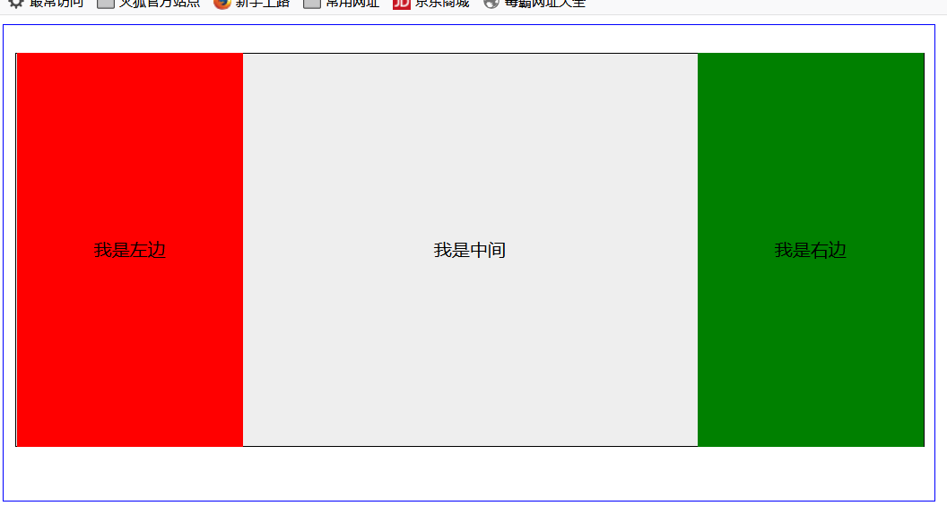
代码如下:
<!doctype html><html lang="en"><head><meta charset="UTF-8"><title>圣杯布局</title><style type="text/css">.main{width: 810px;height: 400px;border: 1px blue solid;padding-top: 25px;padding-left: 10px;padding-right: 10px;}._center{width: 100%;height: 350px;text-align: center;line-height: 350px;float: left;background-color: #eeeeee}._left{width: 200px;height: 350px;left: 20px;top:25px;text-align: center;line-height: 350px;float: left;margin-left: -100%;background-color: red;}._right{width: 200px;height: 350px;right:20px;top:25px;text-align: center;line-height: 350px;float: left;margin-left:-200px;background-color: green;}</style></head><body><div class="main clearfix"><div class="_center">我是中间</div><div class="_left">我是左边</div><div class="_right">我是右边</div></div></body></html>
效果图:
2.双飞翼布局:
(1)父元素中包含左中右三个盒子,并且让他们分别左浮动。
(2)将中间的盒子宽度设为100%,并且它在html中代码位置放在左右代码位置的上面(就是所说的第一个渲染)。
(3)左右两边使用margin-left的负值,使他们与中间的盒子同行,(左边:-100%,右边:-右边盒子的宽度)。
(4)给中间元素设置子元素,并给其左右margin为左右盒子留位置
(6)给父元素清除浮动.
代码如下:
<!doctype html><html lang="en"><head><meta charset="UTF-8"><title>双飞翼布局</title><style type="text/css">.main{width: 800px;height: 400px;padding-top: 25px;margin: 0;}._center{width: 100%;height: 350px;float: left;background-color: #eeeeee;}._center>div{margin: 0 200px 0 200px;}._left{width: 200px;height: 350px;left: 20px;top:25px;text-align: center;line-height: 350px;float: left;margin-left: -100%;background-color: red;}._right{width: 200px;height: 350px;right:20px;top:25px;text-align: center;line-height: 350px;float: left;margin-left:-200px;background-color: green;}</style></head><body><div class="main clearfix"><div class="_center"><div>我是中间我是中间我是中间我是中间我是中间我是中间我是中间我是中间我是中间我是中间我是中间我是中间我是中间我是中间我是中间我是中间我是中间我是中间我是中间我是中间我是中间我是中间我是中间</div></div><div class="_left">我是左边</div><div class="_right">我是右边</div></div></body></html>
效果如下:
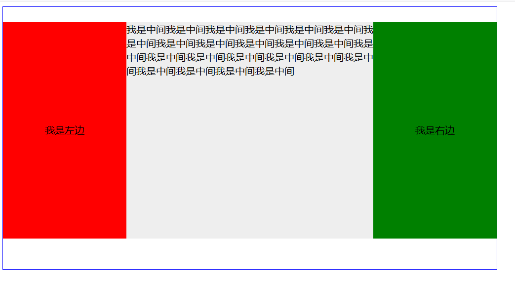
注:为中间元素设置子元素,并为其设置margin,目的是为了中间元素的内容可以在中间显示,margin的左右值为左右盒子的宽度。


 秒速五厘米
秒速五厘米 深藏阁楼爱情的钟
 淩亂°似流年
 Bertha 。
 爱被打了一巴掌
Oracle中用Exp命令导出指定用户下的所有表的前N行数据,并用imp数据导入到本地数据库中--修改编码")


还没有评论,来说两句吧...