seaborn直方图、散点图与回归分析图的绘制
学习了seaborn的基本风格操作设置之后我们便操作seaborn学习直方图、散点图的绘制方法,以及对数据进行回归分析的方法(本文使用jupyter notebook为开发环境)。
直方图的绘制
首先我们导入必须的包以及matplotlib的魔法方法,使得我们绘制的图象能直接显示;并为随机数设置种子,使得每次执行相同方法产生相同的随机数。import numpy as np
import matplotlib.pyplot as plt
import seaborn as sns
%matplotlib inlinesns.set(color_codes=True)
np.random.seed(sum(map(ord, ‘distributions’)))当我们设置相同的seed,每次生成的随机数相同。
如果不设置seed,则每次会生成不同的随机数
map() 会根据提供的函数对指定序列做映射。
即返回’distributions’该字符串每个字母的二进制数
并用sum函数求和,将和作为种子,这里似乎是习惯上的写法。
运用distplot函数进行直方图的绘制:
# 直方图的绘制x = np.random.normal(size=100) # 产生一组数量为100的高斯分布数据sns.distplot(x, kde=True) # kde控制是否显示核密度估计图
结果如图: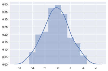
displot可选参数如下:(参考官方文档)
a : Series, 1d-array, or list.
Observed data. If this is a Series object with a name attribute, the name will be used to label the data axis.
bins : argument for matplotlib hist(), or None, optional #设置矩形图数量
Specification of hist bins, or None to use Freedman-Diaconis rule.
hist : bool, optional #控制是否显示条形图
Whether to plot a (normed) histogram.
kde : bool, optional #控制是否显示核密度估计图
Whether to plot a gaussian kernel density estimate.
rug : bool, optional #控制是否显示观测的小细条(边际毛毯)
Whether to draw a rugplot on the support axis.
fit : random variable object, optional #控制拟合的参数分布图形
An object with fit method, returning a tuple that can be passed to a pdf method a positional arguments following an grid of values to evaluate the pdf on.
{hist, kde, rug, fit}_kws : dictionaries, optional
Keyword arguments for underlying plottin
散点图的绘制
利用jointplot()函数进行散点图的绘制绘制散点图
生成指定均值与协方差的200个数据
协方差数据一般以元组形式给出,表示某数的次方
import pandas as pd
mean, cov = [0, 1], [(1, .5), (.5, 1)]
data = np.random.multivariate_normal(mean, cov, 1000)
df = pd.DataFrame(data, columns=[‘x’, ‘y’])
结果如下: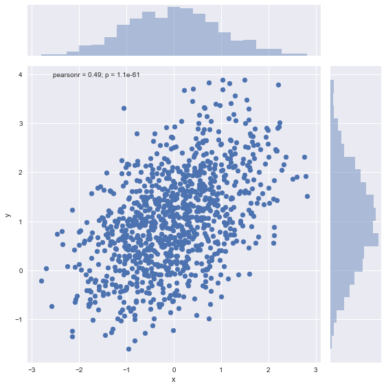
可以看出来散点图的xy轴上还有数据分布的直方图。
如果我们数据较多,会发现点的分布过于密集,无法查看直观的分布状况。这时我们指定kind参数,使图变成蜂窝状的显示:
sns.jointplot(x='x', y='y', data=df, kind='hex', size=(8))
结果如图: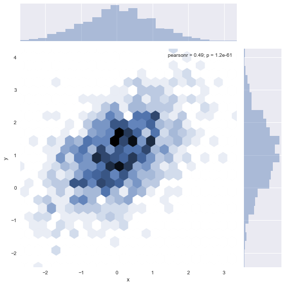
我们还可以通过with语句与axes_style()函数的连用使得我们暂时的改变绘图风格,使得最终图像成为黑白间隔的风格。
with sns.axes_style('white'):sns.jointplot(x='x', y='y', data=df, kind='hex', color='k', size=(9))
结果如图: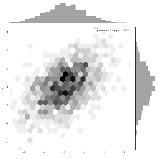
我们可以通过改变具体参数或调用函数,做出更独特的图(请自行查阅官方文档)。
成对数据的显示
我们载入seaborn的内置数据iris(鸢尾花),用pairplot()函数显示数据。正对角线表示一维 非对角线表示二维
iris = sns.load_dataset(‘iris’)
sns.pairplot(iris)
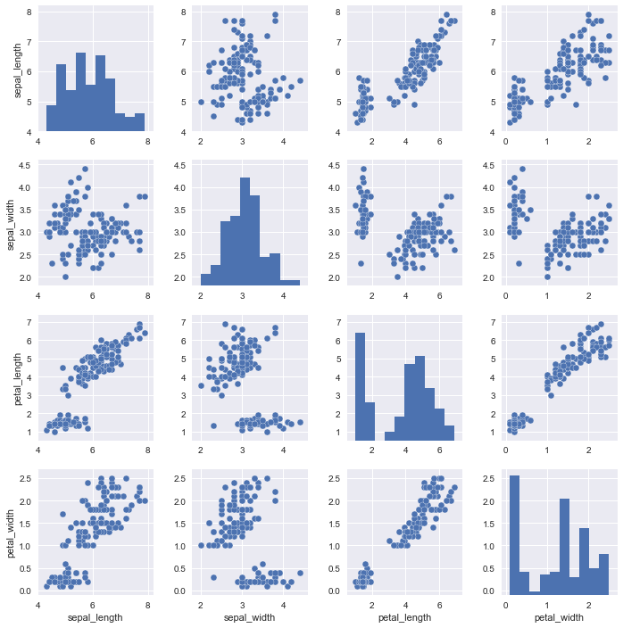
正对角线的数据代表相同的数据集。
regplot()和lmplot()都可以绘制回归方程,但是初学者推荐用regplot()
代码如下:
sns.set_style('whitegrid')plt.figure(figsize=(9,6))sns.regplot(x='total_bill', y='tip', data=tips)
结果如图: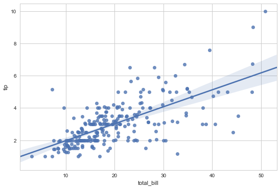
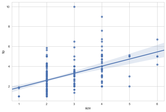
如果我们的x值设定为size则会发现结果有些不适合于观察,大体为竖直的直线。
plt.figure(figsize=(9,6))sns.regplot(x='size', y='tip', data=tips)
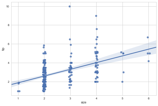
这时我们要设定一个x的偏离值,代码如下:
plt.figure(figsize=(9,6))# 设置偏离值sns.regplot(x='size', y='tip', data=tips, x_jitter=.05)
总结
seaborn的应用比matplotlib更加简便一些,我们可以利用几行语句便绘制出风格鲜明的图例,但是seaborn说白了还只是一个工具罢了,我们不用很理解每一个参数代表什么或者记忆那些绘图函数,必要时查看官方文档即可。


")


")


还没有评论,来说两句吧...