这样设计一个可扩展、通用的、健壮性组件
点击上方关注 小生方勤,一起学习,天天进步
前言
组件是页面不可或缺的部分,而设计组件就成为了前端同学每日工作。
所以
一位程序员的职业生涯大约十年,只有人寿命的十分之一。前端项目只是你生活工作的一部分,而你却是它的全部,你是他的灵魂。请放下长时间的游戏、工作时的摸鱼。多学习来以最完美的状态好好陪你项目!
正文
这篇文章将会以本人所认知的角度去对组件的封装设计展开思考。如果你对我的观点,方式,又或者你有更好的方式,更优的设计模式,不妨在评论区一起讨论 思考, 交流是进步的必经之路。
知识点
- 组件是如何分类的
- Vue 和 React 封装组件模式
- 怎样才是一个好的可扩展、通用的、健壮性组件
- 思考讨论,提出问题
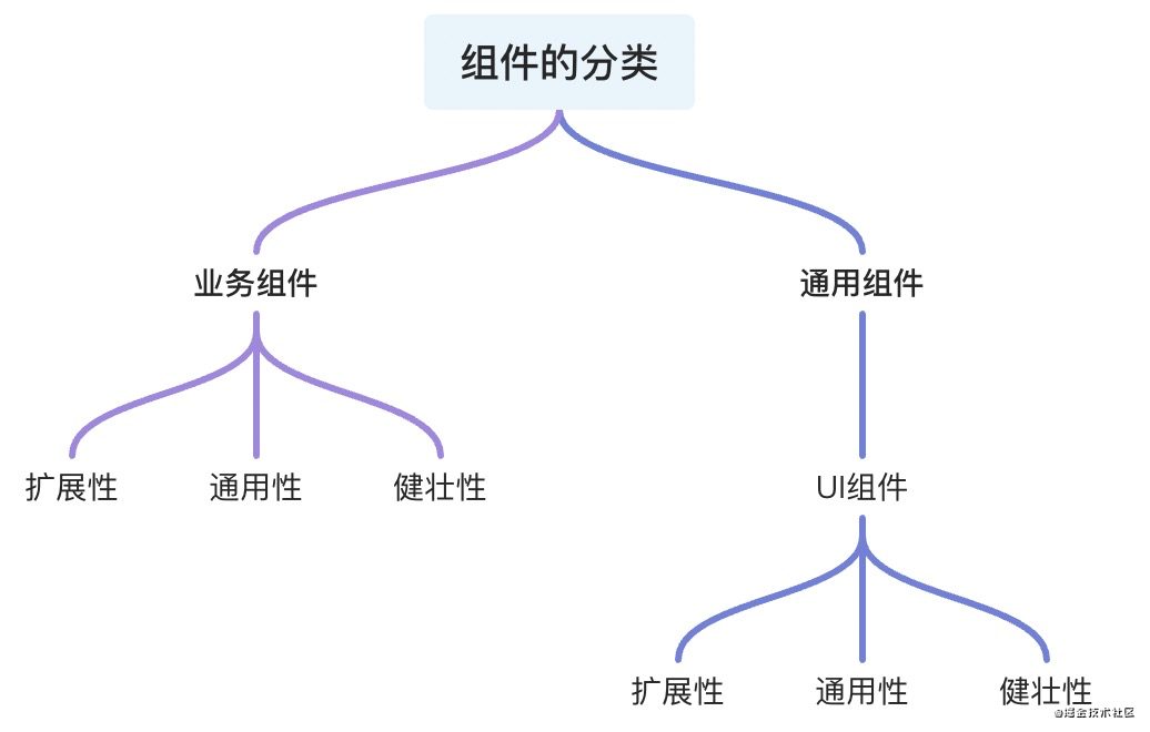
组件是如何分类的
- 业务组件
通用组件(非业务组件)
- UI组件
 1627627583874_8398E85B-D83D-430B-AF41-D4D3F8CF04C0.png
无论是 业务组件 或者 通用组件都具备组件本质所包含的三个性质扩展、通用、健壮
- 扩展性:在原有组件基础上可 二次封装 扩展成新的组件符合设计的
开闭原则 - 通用性:根据组件接受的
参数和组件中与业务的解耦比来衡量组件的通用性,并不是通用性占比100%的组件就是最好的组件,需要根据 不同的场景 分析 - 健壮性:避免组件中
参数处理和函数执行过程可能出现的奔溃和错误导致程序的直接挂断,单测以对组件内部 做好边界处理,异常错误的捕获来衡量这一标准
业务组件
服务与业务的组件称为业务组件,项目中组件的划分是分页面级组件、全局级别组件
--- componentes--- pages复制代码
而结构一般是这样
componentes 中存放的组件往往 具有当前项目 中的多个 场景 复用 才会进行设计与封装
Vue中的组件
<template>....</template><script>export default {props: {...},data () {....},methods: {....}}</script>复制代码
React中的组件
import React, { Component } from react ;export default class Demo extends Component {state = {};componentDidMount() {...}render() {const { .... } = this.props;return (<div>....</div>);}}复制代码
这是目前两个 两个框架最基本的组件封装 模板。
而你在封装组件的时候是否考虑过一些问题
- 组件的可维护性?
- 组件的可读性?
- 扩展性、健壮性、通用性?
- 这个组件是否需要封装抽离?
- 组件是否和业务强关联?
这些问题在组件封装开始编码之前你是否都考虑过了
凡是组件不断扩展,使其通用性提升,必然就会降低组件的 易用性质
而不断丰富一个组件,也会导致其组件代码过长,组件使命不单一,不易读,不易维护
像Vue 和 React 推荐 一个组件代码长度在 200 - 500 行最佳
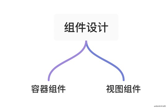
业务中的组件往往区分
 1627627666905_1E9DC37D-8E0E-45C7-814A-63CA34D3936C.png
- 容器组件负责处理
业务相关逻辑,注册业务相关钩子,传入相应的熟悉和插槽等 - 视图组件则负责
数据的呈现,交互的实现
 1627634474901_9F20476A-9B8A-4360-A907-C79218F72E55.png
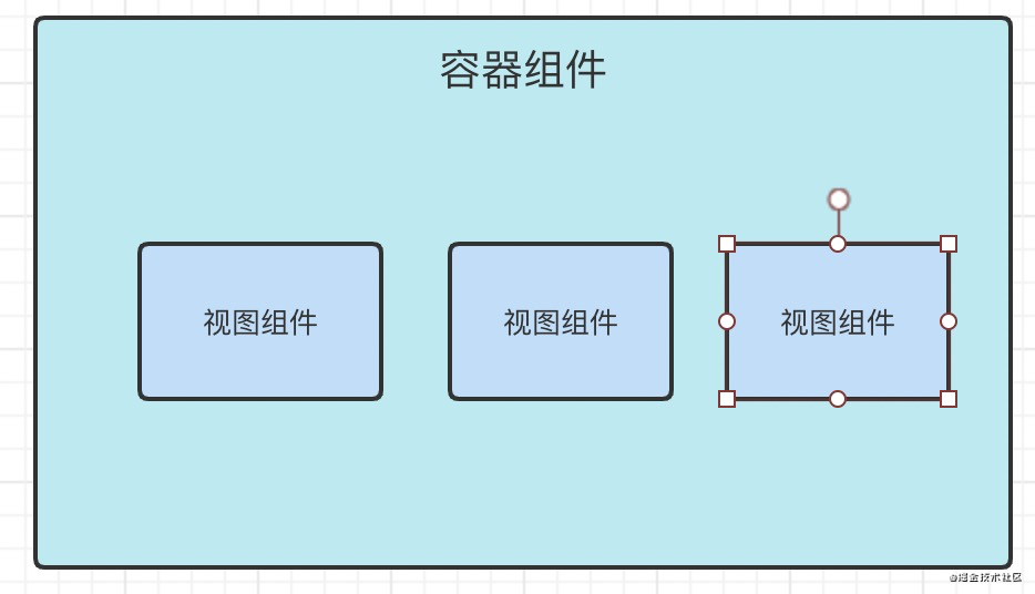
容器组件往往不可复用
视图组件则根据组件的样式 和 交互 判断组件在项目中的 频率 来抉择是否封装
视图 和 数据 解耦 又能搭配 可以很好的提升组件的 可读,易维护性
这个组件是否需要封装抽离?
这可能是新前端同学容易遇到的问题
不是所以 DOM 结构 都需要 抽离
你需要对你所负责的项目 UI走向 有着全局的洞察力,如果不确认的是否需要封装,建议不封装
下次业务中存在与原来视图 UI 相同的需求 再进行封装设计,而不是快速 Copy
组件是否和业务强关联?
通常情况,组件中的大量数据来源 当前组件的接口请求。没有依赖或者几乎不依赖外部传入的props等,称为业务强关联组件,放弃组件封装的想法。
怎样才是一个好的可扩展、通用的、健壮性组件?
我们可以参考一下star高的 Ant design 和 Element 来学习
Ant design 中 rc-switch
import * as React from react ;import classNames from classnames ;import useMergedState from rc-util/lib/hooks/useMergedState ;import KeyCode from rc-util/lib/KeyCode ;const Switch = React.forwardRef(({prefixCls = rc-switch ,className,checked,defaultChecked,disabled,loadingIcon,checkedChildren,unCheckedChildren,onClick,onChange,onKeyDown,...restProps},ref,) => {const [innerChecked, setInnerChecked] = useMergedState<boolean>(false, {value: checked,defaultValue: defaultChecked,});function triggerChange(newChecked: boolean,event: React.MouseEvent<HTMLButtonElement> | React.KeyboardEvent<HTMLButtonElement>,) {let mergedChecked = innerChecked;if (!disabled) {mergedChecked = newChecked;setInnerChecked(mergedChecked);onChange?.(mergedChecked, event);}return mergedChecked;}function onInternalKeyDown(e) {if (e.which === KeyCode.LEFT) {triggerChange(false, e);} else if (e.which === KeyCode.RIGHT) {triggerChange(true, e);}onKeyDown?.(e);}function onInternalClick(e) {const ret = triggerChange(!innerChecked, e);// [Legacy] trigger onClick with valueonClick?.(ret, e);}const switchClassName = classNames(prefixCls, className, {[`${prefixCls}-checked`]: innerChecked,[`${prefixCls}-disabled`]: disabled,});return (<button{...restProps}type="button"role="switch"aria-checked={innerChecked}disabled={disabled}className={switchClassName}ref={ref}onKeyDown={onInternalKeyDown}onClick={onInternalClick}>{loadingIcon}<span className={`${prefixCls}-inner`}>{innerChecked ? checkedChildren : unCheckedChildren}</span></button>);},);Switch.displayName = Switch ;export default Switch;复制代码
- 直接脱离
UI - 接受参数,处理钩子
而 Ant design 则是对API 和 UI 的二次封装
进而体现了 React Components[1] 的组件的 可扩展性
再看看
Element UI 的 Switch
<template><divclass="el-switch":class="{ is-disabled : switchDisabled, is-checked : checked }"role="switch":aria-checked="checked":aria-disabled="switchDisabled"@click.prevent="switchValue"><inputclass="el-switch__input"type="checkbox"@change="handleChange"ref="input":id="id":name="name":true-value="activeValue":false-value="inactiveValue":disabled="switchDisabled"@keydown.enter="switchValue"><span:class="[ el-switch__label , el-switch__label--left , !checked ? is-active : ]"v-if="inactiveIconClass || inactiveText"><i :class="[inactiveIconClass]" v-if="inactiveIconClass"></i><span v-if="!inactiveIconClass && inactiveText" :aria-hidden="checked">{{ inactiveText }}</span></span><span class="el-switch__core" ref="core" :style="{ width : coreWidth + px }"></span><span:class="[ el-switch__label , el-switch__label--right , checked ? is-active : ]"v-if="activeIconClass || activeText"><i :class="[activeIconClass]" v-if="activeIconClass"></i><span v-if="!activeIconClass && activeText" :aria-hidden="!checked">{{ activeText }}</span></span></div></template><script>import emitter from element-ui/src/mixins/emitter ;import Focus from element-ui/src/mixins/focus ;import Migrating from element-ui/src/mixins/migrating ;export default {name: ElSwitch ,mixins: [Focus( input ), Migrating, emitter],inject: {elForm: {default:}},props: {value: {type: [Boolean, String, Number],default: false},disabled: {type: Boolean,default: false},width: {type: Number,default: 40},activeIconClass: {type: String,default:},inactiveIconClass: {type: String,default:},activeText: String,inactiveText: String,activeColor: {type: String,default:},inactiveColor: {type: String,default:},activeValue: {type: [Boolean, String, Number],default: true},inactiveValue: {type: [Boolean, String, Number],default: false},name: {type: String,default:},validateEvent: {type: Boolean,default: true},id: String},data() {return {coreWidth: this.width};},created() {if (!~[this.activeValue, this.inactiveValue].indexOf(this.value)) {this.$emit( input , this.inactiveValue);}},computed: {checked() {return this.value === this.activeValue;},switchDisabled() {return this.disabled || (this.elForm || {}).disabled;}},watch: {checked() {this.$refs.input.checked = this.checked;if (this.activeColor || this.inactiveColor) {this.setBackgroundColor();}if (this.validateEvent) {this.dispatch( ElFormItem , el.form.change , [this.value]);}}},methods: {handleChange(event) {const val = this.checked ? this.inactiveValue : this.activeValue;this.$emit( input , val);this.$emit( change , val);this.$nextTick(() => {// set input s checked property// in case parent refuses to change component s valuethis.$refs.input.checked = this.checked;});},setBackgroundColor() {let newColor = this.checked ? this.activeColor : this.inactiveColor;this.$refs.core.style.borderColor = newColor;this.$refs.core.style.backgroundColor = newColor;},switchValue() {!this.switchDisabled && this.handleChange();},getMigratingConfig() {return {props: {on-color : on-color is renamed to active-color. ,off-color : off-color is renamed to inactive-color. ,on-text : on-text is renamed to active-text. ,off-text : off-text is renamed to inactive-text. ,on-value : on-value is renamed to active-value. ,off-value : off-value is renamed to inactive-value. ,on-icon-class : on-icon-class is renamed to active-icon-class. ,off-icon-class : off-icon-class is renamed to inactive-icon-class.}};}},mounted() {/* istanbul ignore if */this.coreWidth = this.width || 40;if (this.activeColor || this.inactiveColor) {this.setBackgroundColor();}this.$refs.input.checked = this.checked;}};</script>复制代码
很直观的看出, 除了语法 方面 封装设计组件UI的最佳方式
- 零业务代码
- 优秀的
UI和API设计 易学和易用
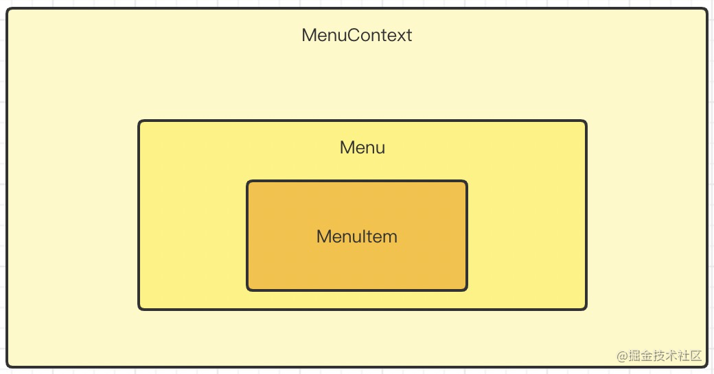
我们再看看另外一种封装组件的方式
 1627634757928_22274B24-4A7F-4B1B-8307-3A565B77A956.png
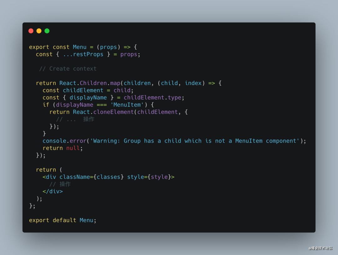
React For Menu
 carbon (1).png
这是 React 配套组件的封装 的一种思路
- 创建
context管理 组件组 的数据流 - 父组件中存在判断 子组件的类型 增加健壮性
- 在
index挂载 分别导出组件
Vue For Menu
<template><divclass="menu"// 事件绑定>// menuItem<slot></slot></div></template><script>export default {mixins: [...],name: Menu ,componentName: Menu ,inject: {menu: {default:},},provide() {return {menu : this};}}</script>复制代码
在 Vue - UI 组件的设计封装中 , 经常使用 provide,inject来组件通信.
Vue 除了使用 slot 还可以使用 jsx & function component 来实现如此效果,其设计思想和 React 大同小异
在 Vue3 中 Ant design for Vue 中大量使用 jsx 来 封装 组件
下面简单总结一下
- 组件中的
UI和数据业务尽量 分离 UI视图组件中 不该包含业务代码- 组件设计之初考虑
通用、易用、扩展、健壮稳定以及良好的代码结构、Api设计使用
思考讨论,提出问题
- 你有不同的或者更好的设计封装组件的
技巧和Demo吗 - 你是如何判断组件是否封装的?如何设计组件的?
- 回想一下你设计的组件
代码、Api、命名是否给其他同学带来不便 - 等等…..
根据以上的问题、思考 或者 你有不同的想法 不妨在评论区中我们一起探讨,学习!
关于本文
来源:遇见同学
https://juejin.cn/post/6991261103141421092
点个『在看』支持下 


 红太狼
红太狼 ╰半夏微凉°
 深藏阁楼爱情的钟


——第一个MyBatis程序及配置")


还没有评论,来说两句吧...