Element UI学习3--Cascader 级联选择器
1、基础用法
1、默认 click 触发子菜单
<div class="block"><span class="demonstration">默认 click 触发子菜单</span><el-cascader v-model="value" :options="options" @change="handleChange"></el-cascader></div><script>export default {data(){return{value:[],options:[{value:'zhejiang',label:'浙江',children:[{value:'hangzhou',label:'杭州',children:[{value:'yuhang',label:'余杭'},{value:'xiaoshan',label:'萧山'},{value:'binjiang',label:'滨江'},{value:'gongshu',label:'拱墅'}]},{value:'ningbo',label:'宁波',children:[{value:'jiangbei',label:'江北'},{value:'zhenhai',label:'镇海'},{value:'beilun',label:'北仑'}]}]},{value:'jiangxi',label:'江西',children:[{value:'shangrao',label:'上饶',children:[{value:'poyang',label:'鄱阳'},{value:'yugan',label:'余干'},{value:'yushan',label:'玉山'},{value:'wannian',label:'万年'},{value:'wuyuan',label:'婺源'}]}]}]}},methods:{handleChange(value){console.log(value)}}}</script>
如图:
2、属性show-all-levels定义了是否显示完整的路径,将其赋值为false则仅显示最后一级
<div class="block"><span class="demonstration">默认 click 触发子菜单</span><el-cascader v-model="value" :options="options" @change="handleChange" :show-all-levels="false"></el-cascader></div>
如图: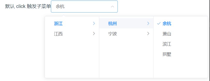
3、通过props.expandTrigger可以定义展开子级菜单的触发方式。
<div class="block"><span class="demonstration">hover 触发子菜单</span><el-cascader v-model="value" :options="options" :props="{ expandTrigger: 'hover' }" @change="handleChange"></el-cascader></div>
如图: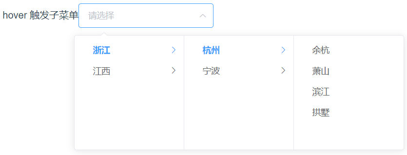
2、多选
1、默认显示所有Tag
可通过 props.multiple = true 来开启多选模式
<div class="block"><span class="demonstration">默认显示所有Tag</span><el-cascader :options="options" :props="props" clearable></el-cascader></div><script>export default {data(){return{props:{ multiple:true},options:[{value: 1,label: '浙江',children:[{value: 2,label: '杭州',children:[{ value: 3, label: '余杭' },{ value: 4, label: '拱墅' },{ value: 5, label: '萧山' }]},{value: 6,label: '宁波',children:[{ value: 7, label: '江北' },{ value: 8, label: '镇海' },{ value: 9, label: '北仑' }]}]},{value: 10,label: '江西',children:[{value: 11,label: '上饶',children:[{ value: 12, label: '鄱阳' },{ value: 13, label: '余干' },{ value: 14, label: '婺源' },{ value: 15, label: '玉山' }]},{value: 16,label: '南昌',children:[{ value: 17, label: '青山湖' },{ value: 18, label: '红谷滩' },{ value: 19, label: '高新' },{ value: 20, label: '向塘' }]}]}]}}}
如图: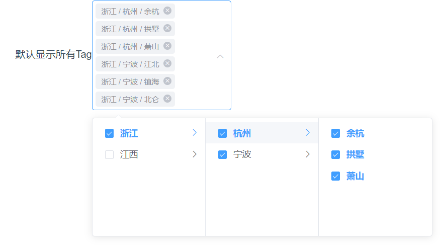
2、折叠展示Tag
使用collapse-tags来折叠Tag
<div class="block"><span class="demonstration">折叠展示Tag</span><el-cascader :options="options" :props="props" clearable collapse-tags></el-cascader></div>
如图: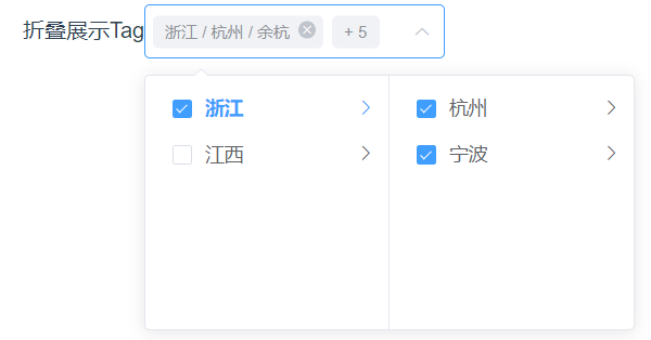
3、选择任意一级选项
1、单选选择任意一级选项
可通过 props.checkStrictly = true 来设置父子节点取消选中关联,从而达到选择任意一级选项的目的。
<div class="block"><span class="demonstration">单选选择任意一级选项</span><el-cascader :options="options" :props="{ checkStrictly: true }" clearable></el-cascader></div>
如图: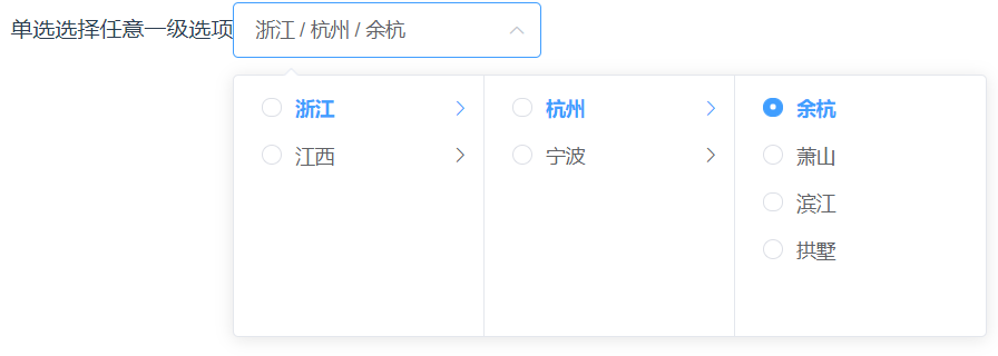
2、多选选择任意一级选项
/div> --><div class="block"><span class="demonstration">多选选择任意一级选项</span><el-cascader :options="options" :props="{ multiple: true,checkStrictly: true }" clearable></el-cascader></div>
如图;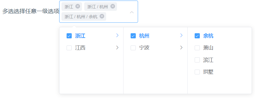
4、自定义节点内容
可以通过scoped slot对级联选择器的备选项的节点内容进行自定义,
scoped slot会传入两个字段 node 和 data,
分别表示当前节点的 Node 对象和数据。
<el-cascader :options="options"><template slot-scope="{ node, data }"><span>{{ data.label }}</span><span v-if="!node.isLeaf"> ({{ data.children.length }}) </span></template></el-cascader>
如图:
5、级联面板
级联面板是级联选择器的核心组件,与级联选择器一样,有单选、多选、动态加载等多种功能。
<el-cascader-panel :options="options"></el-cascader-panel>
如图:


 Bertha 。
 我就是我
我就是我 约定不等于承诺〃
 亦凉
亦凉
")


还没有评论,来说两句吧...