portal vue实现前端可视化portal(一)
项目需求: 组件分为内置组件 ,自定义组件,可以实现拖拽的形式实现一个门户页面的创建,当然也可以实现可视化大屏的创建,一开始内心是拒绝的,这玩意做出来,我是不是就要失业了。
一. 初版demo演示
二.项目结构
- design 设计器
- renderer 渲染器
- 后台管理配置
2.1 设计器
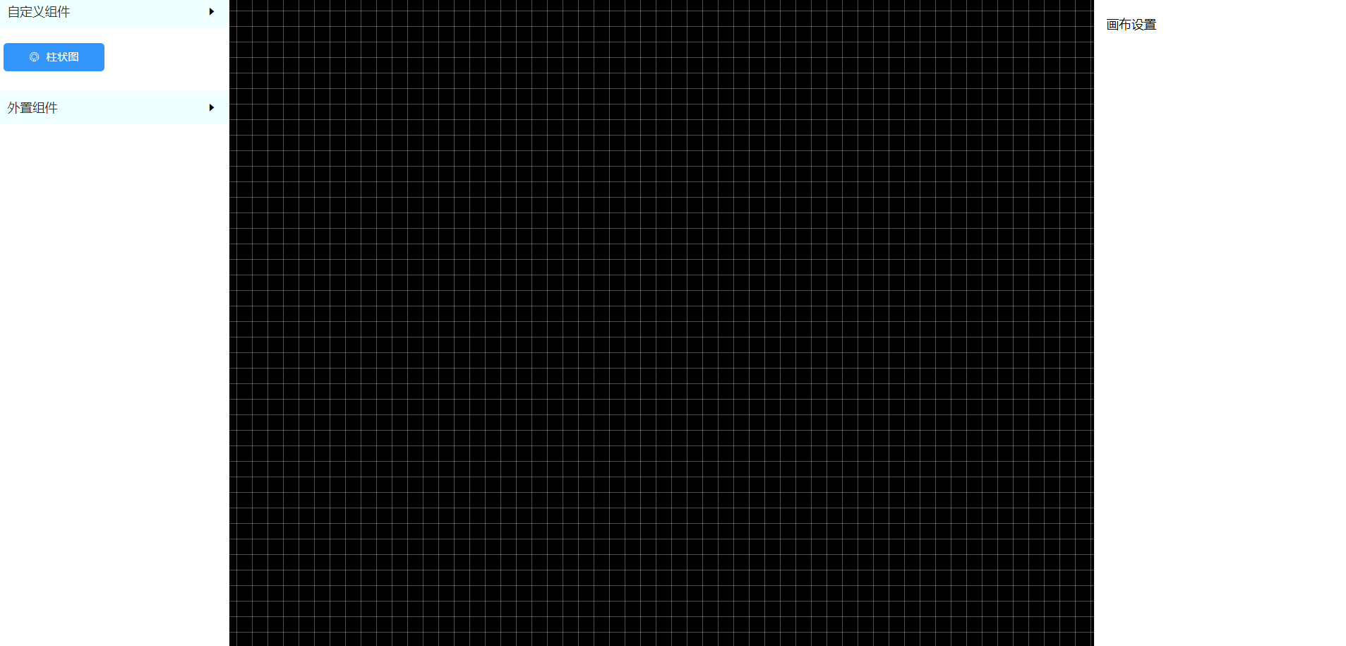
就是demo展示的这个玩意,就是一个画布,可以让非开发人员去进行设计,分为内置组件,自定义组件
- 自定义组件
就是设计器里面内置的组件,会单独放一个文件夹里面,后面打包发到npm上,给渲染器直接使用 - 自定义插件
内置组件不满足的,按照一定的规则,自己去写组件上传(设计器不支持配置),现在想的是两种方案,一种是webpack按照一定规则打包成js上传,然后渲染器,设计器通过script方式动态注入,这里就牵扯到new Vue的时机问题,因为只能事全局组件,就是牵扯到加载js导致UI界面卡一会的问题,第二种方案就是vue-cli3提供的单文件打包,异步script引入,但是样式这一块还需要解决,后面再考虑吧
用到的一些插件以及方案
- 状态管理使用
provideinject不使用vuex了。 - vue-draggable 拖拽 https://github.com/SortableJS/Vue.Draggable
- vue-draggable-resizable https://github.com/gorkys/vue-draggable-resizable-gorkys
- echarts
题外话: 可以用这两个插件去做自定义打印
组件json配置文件
const patams = {mamDataType: 1, // 数据类型mamHidden: true, // 组件隐藏显示mamDataValue: '', // 数据值mamRefreshTime: 0, // 刷新时间mamDataProcessing: '', // 数据处理mamMethod: 'post', // 接口请求方式mamApi: 'http://' // 接口地址}export default [{name: '柱状图',key: '',icon: 'demo',type: 'k-histogram',options: {width: 300,height: 200,x: 10,y: 10,...patams,mamCategory: true,title: {text: '',subtext: '',textAlign: 'left',textStyle: {color: '#333333',fontSize: 16},subtextStyle: {color: '#666666',fontSize: 12}},grid: {width: 'auto',height: 'auto'},backgroundColor: 'rgba(255, 255, 255, .6)',color: ['#3296fa'],xAxis: {type: 'category',data: ['Mon', 'Tue', 'Wed', 'Thu', 'Fri']},yAxis: {type: 'value'},series: [{data: [120, 200, 150, 80, 70],type: 'bar'}]}}]
设计器左侧组件列表
<template><div id="component-library"><!-- 内置组件 --><div id="built-in" class="component-box"><div class="component-box-header"><span class="title">自定义组件</span><i class="el-icon-caret-right" /></div><draggableclass="component-box-content":list="componentsData":group="{ name: 'component', pull: 'clone', put: false }"@start="handleEnd"><component-item v-for="(item, index) in componentsData" :key="index" :icon="item.icon" :name="item.name" /></draggable></div><!-- 外置组件 --><div id="external" class="component-box"><div class="component-box-header"><span class="title">外置组件</span><i class="el-icon-caret-right" /></div></div></div></template><script>import componentsData from '@/config/components'import componentItem from '@/components/ComponentItem/index'import uuid from 'node-uuid'export default {name: 'ComponentLibrary',components: {componentItem},data() {return {componentsData}},methods: {handleEnd(evt) {// 通过key来保证组件的唯一性this.componentsData[evt.oldIndex].key = uuid.v1()}}}</script>
舞台画布
<template><div id="stage-canvas" @click="handleCanvas"><draggableclass="draggable-box":list="componentList"group="component"@change="handleChange"><vue-draggable-resizablev-for="(item, index) in componentList"v-if="item.options.mamHidden":key="index"eslint-disable-next-linevueno-use-v-if-with-v-for:grid="[20,20]":x="10":y="10":w="item.options.width":h="item.options.height":snap="true":snap-tolerance="10":parent="true":lock-aspect-ratio="true":prevent-active-behavior="true":parent-limitation="true":is-active="true":enable-native-drag="true"@refLineParams="getRefLineParams"@activated="activated(item)"@resizestop="resizestop"><component :is="item.type" :options="item.options" :dom-id="'domId' + index" /></vue-draggable-resizable><!--辅助线--><spanv-for="(item, index) in vLine"v-show="item.display":key="'A' + index"class="ref-line v-line":style="{ left: item.position, top: item.origin, height: item.lineLength}"/><spanv-for="(item, index) in hLine"v-show="item.display":key="'B' + index"class="ref-line h-line":style="{ top: item.position, left: item.origin, width: item.lineLength}"/><!--辅助线END--></draggable></div></template><script>import draggable from './mixin/draggable'import resize from './mixin/resize'export default {name: 'StageCanvas',inject: ['app'],mixins: [draggable, resize],data() {return {componentList: [],vLine: [],hLine: [],enableNativeDrag: false,activeComponent: {} // 被激活的组件}}}</script><style lang="scss">@import '../../styles/theme.scss';#stage-canvas{flex: 1;background: $stage-canvas-theme;border-left: 1px solid #eee;border-right: 1px solid #eee;position: relative;background: linear-gradient(-90deg, rgba(255,255,255, .3) 1px, transparent 1px) 10px 10px/20px 20px, linear-gradient(rgba(255,255,255, .3) 1px, transparent 1px) 0% 0%/20px 20px;.draggable-box{width: 100%;height: 100%;}}</style>
属性配置面板
<template><div id="attr-configuration"><!-- 画布操作 --><p v-if="JSON.stringify(app.attrData.options) === '{}'">画布设置</p><!-- 组件操作 --><el-form v-else :data="app.attrData" label-width="100px" label-position="left"><el-tabs v-model="activeName"><el-tab-pane label="配置" name="first"><config-tab /></el-tab-pane><el-tab-pane label="数据" name="second"><data-tab /></el-tab-pane><el-tab-pane label="格式化" name="third"><format-tab /></el-tab-pane><el-tab-pane label="参数" name="fourth">定时任务补偿</el-tab-pane></el-tabs></el-form></div></template><script>import ConfigTab from './modules/ConfigTab'import DataTab from './modules/DataTab'import FormatTab from './modules/FormatTab'export default {name: 'AttrConfiguration',components: {ConfigTab,DataTab,FormatTab},inject: ['app'],data() {return {activeName: 'first'}}}</script><style lang="scss">@import './AttrConfiguration.scss';</style>
柱状图组件
<template><div :id="domId" class="histogram" /></template><script>export default {name: 'Histogram',props: {options: {type: Object,default: () => {}},domId: {type: String,default: ''}},data() {return {chart: null}},watch: {options: {handler(data) {let xAxis = {}let yAxis = {}if (data.mamCategory) {yAxis = { type: 'category', data: ['Mon', 'Tue', 'Wed', 'Thu', 'Fri'] }xAxis = { type: 'value' }} else {xAxis = { type: 'category', data: ['Mon', 'Tue', 'Wed', 'Thu', 'Fri'] }yAxis = { type: 'value' }}const options = {...data,xAxis,yAxis}this.chart.resize()this.chart.setOption(options)},deep: true}},mounted() {this.$nextTick(() => {this.chart = window.echarts.init(document.getElementById(this.domId))this.chart.setOption(this.options)})}}</script><style lang="scss">.histogram{min-width: 300px;min-height: 200px;width: 100%;height: 100%;}</style>
App.vue
<template><div id="app"><Layout /></div></template><script>import Layout from '@/components/layout/index'export default {name: 'App',provide() {return {app: this}},components: {Layout},data() {return {attrData: {options: {}}}},methods: {// 设置属性面板对象setAttrData(data) {this.attrData = Object.assign({}, data)}}}</script><style lang="scss">html, body{width: 100%;height: 100%;}#app{width: 100%;height: 100%;}</style>
2.2 渲染器
一个npm包,谁使用谁引,开箱即用的那种
2.3 后台管理
用来管理portal模板,权限等一系列吧
具体功能还在探索当中,后续在更新。


 灰太狼
灰太狼 痛定思痛。
痛定思痛。 超、凢脫俗
超、凢脫俗 红太狼
红太狼


还没有评论,来说两句吧...