CSS3-过渡动画
CSS3 中的 transition 属性用于实现元素从一种样式变换为另一种样式时为元素添加过渡效果。
transition 属性是一个综合属性,可以简写也可以单独设置某个单一的属性。
综合设置语法:
transition: property duration timing-function delay;
property需要过渡的样式属性(必要);值为all则表示所有样式属性duration过渡持续的时间(必要);单位可以是 秒(s) 或 毫秒(ms)timing-function过渡时的速度- 常见的值有 linear(线性过渡,匀速)、ease(由慢到快再到慢)、ease-in(由慢到快)、ease-out(由快到慢)、ease-in-out(由慢到快再到慢)
delay延迟过渡的时间;指定多少秒或毫秒后开始过渡
示例:
CSS:
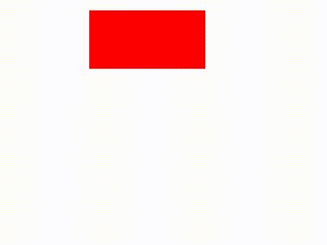
div {width: 100px;height: 50px;background-color: #f00;margin: 10px auto;/* 给元素的 宽 和 背景色添加过渡效果 */transition: width 3s ease-in, background-color 2000ms;}/* 鼠标放上时修改元素的宽高和背景色 */div:hover {width: 600px;height: 100px;background-color: skyblue;}
HTML:
<div></div>

如果只想在鼠标进入时有过渡效果离开时没有,可以直接将过渡属性加给 hover
div:hover {width: 600px;height: 100px;background-color: skyblue;transition: width 3s ease-in, background-color 2000ms;}

单个设置:
transition-property 指定需要过渡的样式属性,多个样式属性用逗号隔开(必要)
transition-duration 过渡持续时间,秒或毫秒(必要)
transition-timing-function 过渡时的速度
transition-delay 指定多少秒或毫秒后开始过渡;延迟过渡
CSS:
div {width: 100px;height: 50px;background-color: #f00;margin: 10px auto;/* 过渡的属性 */transition-property: width, height, border-radius, background;/* 过渡时间 */transition-duration: 2s;/* 速度 */transition-timing-function: ease-in;/* 延迟时间 */transition-delay: 500ms;}div:hover {width: 200px;height: 200px;background: purple;border-radius: 50%;}
HTML:
<div></div>


 ﹏ヽ暗。殇╰゛Y
 ╰+攻爆jí腚メ
 怼烎@
怼烎@ àì夳堔傛蜴生んèń
")

 - 连续3天登录用户")


")


还没有评论,来说两句吧...