CSS3 如何实现飘动的云朵动画
目录
一、动画的定义
二、动画的基本使用
2.1.-animation-name
2.2.-animation-duration
2.3.-animation-timing-function
2.4.-animation-delay
2.5.-animation-iteration-count
2.6.-animation-direction
2.7.-animation-fill-mode
2.8.-animation-play-state
2.9.动画模块连写格式
三、飘动的云朵动画的实现
一、动画的定义
过渡动画是两个状态间的变化,帧动画可以处理动画过程中不同时间的细节变化,不过对过渡动画理解后再不习帧动画会非常容易,也可以把帧动画理解为多个帧之间的过渡动画。
二、动画的基本使用
2.1.-animation-name
指定要绑定到选择器的关键帧的名称,告诉系统需要执行哪个动画
通过@keyframes来设置动画序列,序列中每个关键帧描述动画元素在动画序列的特定时间内如何渲染。关键帧使用了一个百分比来表示在动画序列中出现的时间。0%表示动画的初始时间,也可以通过from关键字表示。100%表示动画的结束时间,也可以通过to关键字表示。
@keyframes animiationName{ keyframes-selector{ css-style; } }
2.2.-animation-duration
动画指定需要多少秒或毫秒完成,告诉系统动画持续的时长
time 指定动画播放完成花费的时间。默认值为 0,意味着没有动画效果。
2.3.-animation-timing-function
设置动画将如何完成一个周期,告诉系统动画执行的速度
| 值 | 执行速度 |
| linear | 动画从头到尾的速度是相同的。匀速 |
| ease | 默认。动画以低速开始,然后加快,在结束前变慢。 |
| ease-in | 动画以低速开始。 |
| ease-out | 动画以低速结束。 |
| ease-in-out | 动画以低速开始和结束。 |
| cubic-bezier(n,n,n,n) | 在 cubic-bezier 函数中自己的值。可能的值是从 0 到 1 的数值。 |
2.4.-animation-delay
设置动画在启动前的延迟间隔。time 可选。定义动画开始前等待的时间,以秒或毫秒计。默认值为0
2.5.-animation-iteration-count
定义动画的播放次数。告诉系统动画需要执行几次
| 值 | 执行次数 |
| n | 一个数字,定义应该播放多少次动画 |
| infinite | 无限次执行 |
2.6.-animation-direction
指定是否应该轮流反向播放动画。
| 值 | 播放方向 |
| normal | 默认的取值, 执行完一次之后回到起点继续执行下一次 |
| alternate | 往返动画, 执行完一次之后往回执行下一次 |
| reverse | 反向执行 |
2.7.-animation-fill-mode
规定当动画不播放时(当动画完成时,或当动画有一个延迟未开始播放时),要应用到元素的样式。
| none | 不做任何改变 |
| forwards | 让元素结束状态保持动画最后一帧的样式 |
| backwards | 让元素等待状态的时候显示动画第一帧的样式 |
| both | 让元素等待状态显示动画第一帧的样式, 让元素结束状态保持动画最后一帧的样式 |
2.8.-animation-play-state
告诉系统当前动画是否需要暂停
running: 执行动画
paused: 暂停动画
2.9.动画模块连写格式
animation:动画名称(animation-name) 动画时长(animation-duration) 动画运动速度(animation-timing-function) 延迟时间(animation-delay) 执行次数(animation-iteration-count) 往返动画(animation-direction);
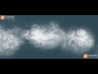
三、飘动的云朵动画的实现
<!DOCTYPE html><html lang="en"><head><meta charset="UTF-8" /><meta http-equiv="X-UA-Compatible" content="IE=edge" /><meta name="viewport" content="width=device-width, initial-scale=1.0" /><title>Document</title><style>/* 天空轮播 晴朗 阴 晴 */* {margin: 0;padding: 0;}.parent {/* vh viewHeight 视口区域高度 vw viewWidth 视口区域宽度 */height: 100vh;background-color: skyblue;animation: sky 10s linear infinite;}/* 定义一个天空动画 */@keyframes sky {0% {background-color: skyblue;}50% {background-color: #000;}100% {background-color: skyblue;}}.cloud_one {width: 300%;height: 600px;margin: 30px auto;background: url(https://i.hd-r.cn/04462965ba09f768e47b6ea8cb065b1c.png) repeat-x;position: fixed;left: 0;top: 0;animation: cloud 20s linear infinite;}.cloud_two {width: 300%;height: 600px;margin: 30px auto;background: url(https://s3.bmp.ovh/imgs/2023/06/10/dc7235f6f0a978b5.png) repeat-x;position: fixed;left: 0;top: 0;animation: cloud 40s linear infinite;}.cloud_three {width: 300%;height: 600px;margin: 30px auto;background: url(https://s3.bmp.ovh/imgs/2023/06/10/8201e7f468f3570c.png) repeat-x;position: fixed;left: 0;top: 0;animation: cloud 60s linear infinite;}@keyframes cloud {from {left: 0;}to {left: -200%;}}</style></head><body><div class="parent"><div class="cloud_one"></div><div class="cloud_two"></div><div class="cloud_three"></div></div></body></html>
最终实现效果如下
图片已转为在线地址,大家可以直接复制使用。


 ゞ 浴缸里的玫瑰
 我不是女神ヾ
 刺骨的言语ヽ痛彻心扉
 àì夳堔傛蜴生んèń

")


还没有评论,来说两句吧...