3D立体动态相册实现代码
今天是情人节,2020-05-20日,身为一名扣脚的程序员必须要拿出点真本事了。知道为什么程序为啥找不到女朋友吗?那么我就告诉你程序员是怎么送女朋友礼物的。
正文:
一、用记事本新建一个text然后件文件名包括后缀都删除掉改成dandelioncloud.html的文件,然后把下面的代码复制进来。代码如下
<!DOCTYPE html><html lang="en"><head><meta charset="UTF-8"><title>纯CSS实现鼠标经过3D立体动态展示图片特效代码 - 蒲公英云</title><link type="text/css" href="css/style.css" rel="stylesheet" /></head><body><div class="box"><ul class="minbox"><li></li><li></li><li></li><li></li><li></li><li></li></ul><ol class="maxbox"><li></li><li></li><li></li><li></li><li></li><li></li></ol></div></body></html>
二、再次新建一个txt修改txt为:style.css然后把下面的css复制进去保存。css样式的代码
@charset "utf-8";*{margin:0;padding:0;}body{max-width: 100%;min-width: 100%;height: 100%;background-size: cover;background-repeat: no-repeat;background-attachment: fixed;background-size:100% 100%;position: absolute;margin-left: auto;margin-right: auto;}li{list-style: none;}.box{width:200px;height:200px;background-size: cover;background-repeat: no-repeat;background-attachment: fixed;background-size:100% 100%;position: absolute;margin-left: 42%;margin-top: 22%;-webkit-transform-style:preserve-3d;-webkit-transform:rotateX(13deg);-webkit-animation:move 5s linear infinite;}.minbox{width:100px;height:100px;position: absolute;left:50px;top:30px;-webkit-transform-style:preserve-3d;}.minbox li{width:100px;height:100px;position: absolute;left:0;top:0;}.minbox li:nth-child(1){background: url(../img/01.png) no-repeat 0 0;-webkit-transform:translateZ(50px);}.minbox li:nth-child(2){background: url(../img/02.png) no-repeat 0 0;-webkit-transform:rotateX(180deg) translateZ(50px);}.minbox li:nth-child(3){background: url(../img/03.png) no-repeat 0 0;-webkit-transform:rotateX(-90deg) translateZ(50px);}.minbox li:nth-child(4){background: url(../img/04.png) no-repeat 0 0;-webkit-transform:rotateX(90deg) translateZ(50px);}.minbox li:nth-child(5){background: url(../img/05.png) no-repeat 0 0;-webkit-transform:rotateY(-90deg) translateZ(50px);}.minbox li:nth-child(6){background: url(../img/06.png) no-repeat 0 0;-webkit-transform:rotateY(90deg) translateZ(50px);}.maxbox li:nth-child(1){background: url(../img/1.png) no-repeat 0 0;-webkit-transform:translateZ(50px);}.maxbox li:nth-child(2){background: url(../img/2.png) no-repeat 0 0;-webkit-transform:translateZ(50px);}.maxbox li:nth-child(3){background: url(../img/3.png) no-repeat 0 0;-webkit-transform:rotateX(-90deg) translateZ(50px);}.maxbox li:nth-child(4){background: url(../img/4.png) no-repeat 0 0;-webkit-transform:rotateX(90deg) translateZ(50px);}.maxbox li:nth-child(5){background: url(../img/5.png) no-repeat 0 0;-webkit-transform:rotateY(-90deg) translateZ(50px);}.maxbox li:nth-child(6){background: url(../img/6.png) no-repeat 0 0;-webkit-transform:rotateY(90deg) translateZ(50px);}.maxbox{width: 800px;height: 400px;position: absolute;left: 0;top: -20px;-webkit-transform-style: preserve-3d;}.maxbox li{width: 200px;height: 200px;background: #fff;border:1px solid #ccc;position: absolute;left: 0;top: 0;opacity: 0.2;-webkit-transition:all 1s ease;}.maxbox li:nth-child(1){-webkit-transform:translateZ(100px);}.maxbox li:nth-child(2){-webkit-transform:rotateX(180deg) translateZ(100px);}.maxbox li:nth-child(3){-webkit-transform:rotateX(-90deg) translateZ(100px);}.maxbox li:nth-child(4){-webkit-transform:rotateX(90deg) translateZ(100px);}.maxbox li:nth-child(5){-webkit-transform:rotateY(-90deg) translateZ(100px);}.maxbox li:nth-child(6){-webkit-transform:rotateY(90deg) translateZ(100px);}.box:hover ol li:nth-child(1){-webkit-transform:translateZ(300px);width: 400px;height: 400px;opacity: 0.8;left: -100px;top: -100px;}.box:hover ol li:nth-child(2){-webkit-transform:rotateX(180deg) translateZ(300px);width: 400px;height: 400px;opacity: 0.8;left: -100px;top: -100px;}.box:hover ol li:nth-child(3){-webkit-transform:rotateX(-90deg) translateZ(300px);width: 400px;height: 400px;opacity: 0.8;left: -100px;top: -100px;}.box:hover ol li:nth-child(4){-webkit-transform:rotateX(90deg) translateZ(300px);width: 400px;height: 400px;opacity: 0.8;left: -100px;top: -100px;}.box:hover ol li:nth-child(5){-webkit-transform:rotateY(-90deg) translateZ(300px);width: 400px;height: 400px;opacity: 0.8;left: -100px;top: -100px;}.box:hover ol li:nth-child(6){-webkit-transform:rotateY(90deg) translateZ(300px);width: 400px;height: 400px;opacity: 0.8;left: -100px;top: -100px;}@keyframes move{0%{-webkit-transform: rotateX(13deg) rotateY(0deg);}100%{-webkit-transform:rotateX(13deg) rotateY(360deg);}}
三、文件的目录结构,把css文件放到css文件夹里,图片放到img文件夹里。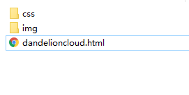
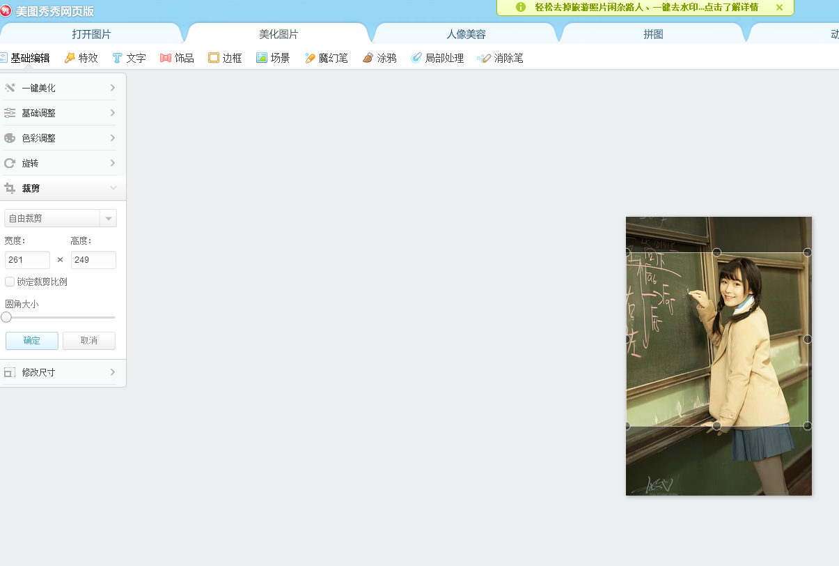
四、如果图片尺寸不会修改的话,可以选择使用美图秀秀网页版很简单,可以在线调整尺寸。然后保存到本地磁盘。
五、容易出现的问题 ,图片展示不全或展示的方向不对
1.图片尺寸需要修改 (解决展示不全的情况)
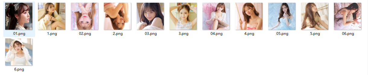
上图是我的图片文件夹里放的图片 ,首先01-06编号命名的图片尺寸是100x100px的大小的,1-6编号是400x400px,如果效果想展示最佳,100x100px的图片是以头部特写的照片最好,因为01-06是立体照片内部小正方体的照片,1-6编号是外部正方体的照片。
2.图片的方向需要修改(解决头朝下的问题)
修改的方向如上图展示所示,比如第三张头就应该朝下,否则形成的效果图像会出现头是倒着的情况。
六、放一下动态效果图

总结:
创建dandelioncloud.html拷贝html保存。html完成。
创建创建 css文件夹 ,在创建好的css文件夹里创建style.css复制css样式到style.css里保存。css完成。
创建img文件夹,把处理好的图片素材放到img文件夹里面。(需要注意的是图片的名称格式一定要和html中的图片格式对上。)
最后双击dandelioncloud.html效果展示。完成。


 缺乏、安全感
 Bertha 。
 今天药忘吃喽~
 我就是我
我就是我 红太狼
红太狼


实验二")


还没有评论,来说两句吧...