CSS布局练习
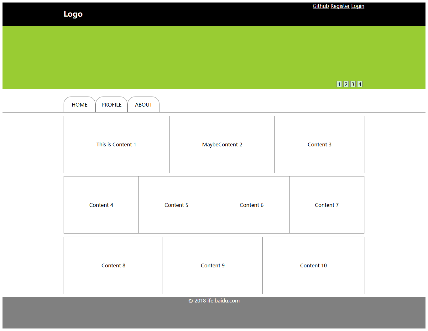
<!DOCTYPE html><html><head><meta charset="utf-8" /><meta http-equiv="X-UA-Compatible" content="IE=edge"><title>Page Title</title><meta name="viewport" content="width=device-width, initial-scale=1"><link rel="stylesheet" type="text/css" media="screen" href="test7-8.css" /></head><body><header><div id="logo"><h2>Logo</h2><div><a>Github</a> <a>Register</a> <a>Login</a></div></div></header><div id="banner"><div id="haha"><div id="hahaha"><div class="click">1</div><div class="click">2</div><div class="click">3</div><div class="click">4</div></div></div></div><nav><div><div>HOME</div><div>PROFILE</div><div>ABOUT</div></div></nav><main><div class="flex1"><div class="content">This is Content 1</div><div class="content">MaybeContent 2</div><div class="content">Content 3</div></div><div class="flex2"><div class="content">Content 4</div><div class="content">Content 5</div><div class="content">Content 6</div><div class="content">Content 7</div></div><div class="flex1"><div class="content">Content 8</div><div class="content">Content 9</div><div class="content">Content 10</div></div></main><footer><div>© 2018 ife.baidu.com</div></footer></body></html>* {font-family: "Microsoft YaHei";}header {width: 100%;background-color: black;}#banner {background-color: rgb(153, 204, 51);width: 100%;height: 200px;}#haha {width: 960px;height: 200px;margin: 0 auto;}#hahaha {width: 100px;height: 20px;float: right;display: flex;justify-content:center;align-items:center;margin-top: 175px;}.click {text-align: center;width: 15px;height: 20px;margin-left: 5px;border-left: 1px solid gray;border-right: 1px solid gray;background-color: rgb(208, 243, 202);}footer {width: 100%;height: 100px;background-color: gray;text-align: center;color: white;}nav {width: 100%;height: 75px;border-bottom: 1px solid gray;}nav > div {width: 960px;height: 75px;margin: 0 auto;font-size: 0;}nav div div {display: inline-block;border: 1px solid gray;border-bottom: none;height: 50px;width: 100px;text-align: center;line-height: 50px;margin-top: 25px;font-size: 16px;border-top-left-radius: 1.5em;border-top-right-radius: 1.5em;}main {width: 960px;margin: 0 auto;}.flex1 {display: flex;margin-top: 10px;margin-bottom: 10px;justify-content: space-between;}.flex2 {display: flex;margin-top: 10px;margin-bottom: 10px;justify-content: space-between;}.content {text-align: center;padding: 80px;border: 1px solid gray;flex-grow: 1;}#logo {width: 960px;height: 75px;margin: 0 auto;}header h2 {color: white;float: left;}header > div > div{color: white;float: right;}a {text-decoration: underline;}


 ゝ一世哀愁。
 àì夳堔傛蜴生んèń
 Bertha 。
 你的名字
你的名字 向右看齐
向右看齐 淩亂°似流年


还没有评论,来说两句吧...