svg 绘制曲线动态进度条 避免canvas锯齿问题
本例使用css3 特性 svg动态描边绘制圆形进度条。
需要进度条有动态效果,使用canvas绘制时,曲线会出现锯齿现象。消除锯齿比较麻烦,于是使用svg动态描边实现,还可避免复杂的js绘图。
代码:
<!DOCTYPE html><html><head lang="en"><meta charset="UTF-8"><title>test</title><meta name="viewport" content="width=device-width, initial-scale=1"><meta name="format-detection" content="telephone=no"/><style> .edu_icon_2{ width: 190px; margin:0 auto; height: 120px; overflow: hidden; position: relative; padding-left: 5px; } /*svg*/ circle { /*使用zepto css或attr动态设置只会自动加逗号 效果:stroke-dasharray: 300px,234px 把动态设置都移到style标签中去*/ /*stroke-dasharray: 300 234;*/ /*通过JS 来修改stroke-dasharray的值*/ /*偏移量 默认重3点钟位置开始 偏移300到8.钟位置*/ stroke-dashoffset: 300; -webkit-animation: dash 1s linear; -moz-animation: dash 1s linear; -o-animation: dash 1s linear; animation: dash 1s linear; } svg{ border-radius: 50%; background: #fbdabb; /*冻结额度的SVG背景颜色为*/ /*background: #E0E0E0;*/ position: relative; z-index: 2; } .qianse{ position: absolute; top: 10px; left: 15px; border-radius:50%; background:#ffffff; width: 160px; height: 160px; z-index: 3; } </style></head><body style="background: #ffffff"><!-- SVG版本--><div class="edu_icon_2"><svg width="180" height="180" version="1.1" xmlns="http://www.w3.org/2000/svg"><circle cx="90" cy="90" r="85" stroke="#F6681C" stroke-width="10" fill="transparent"/><!-- 冻结额度的svg 颜色值为:#B4B4B4--><div class="qianse"></div></svg></div></body><script> //svg版本 var style = document.createElement("style"); style.innerHTML = 'circle{stroke-dasharray: 300 234} @keyframes dash {from {stroke-dasharray: 0 534; } to {stroke-dasharray: 300 234; } };'; document.getElementsByTagName("head")[0].appendChild(style); // 通过控制显示周长来达到比例效果 最大为330;最小0; // 修改的时候还要同时修改css中的circle的 stroke-dasharray的值; </script><script></script></html>
效果图: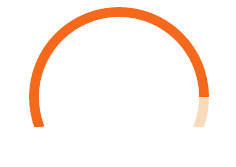


 矫情吗;*
矫情吗;* 太过爱你忘了你带给我的痛
 「爱情、让人受尽委屈。」
 不念不忘少年蓝@
 小鱼儿
小鱼儿 ╰+攻爆jí腚メ


还没有评论,来说两句吧...