一键学会三种定位布局,相对定位、绝对定位、固定定位!
定位布局
定位属性: position作用: 指定元素的定位类型取值:static 默认不定位相对定位绝对定位固定定位
相对定位
关键字 position:relative特点:相对不脱离文档流,并且是占有之前的位置,随着自身原来位置的左顶点进行位置偏移的。偏移量:topleftrightbottom堆叠顺序:在元素出现堆叠效果时改变他们的顺序属性: z-index取值: 没有单位的数字 值越大越靠上,可以是负数<!DOCTYPE html><html lang="en"><head><meta charset="UTF-8"><meta name="viewport" content="width=device-width, initial-scale=1.0"><title>Document</title><style> .father{ width: 300px; height: 300px; border: 1px solid red; margin: 0 auto; } .son1,.son2,.son3{ width: 100px; height: 100px; } .son1{ background-color: red; /* 相对定位 */ position: relative; left: 100px; /* z-index:1; */ } .son2{ background-color: green; /* position: relative; */ left: 100px; top: -100px; } .son3{ background-color: blue; /* position: relative; */ top: -200px; left: 100px; /* z-index: 1; */ } </style></head><body><div class="father"><div class="son1"></div><div class="son2"></div><div class="son3"></div></div></body></html>
图示如下: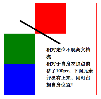
绝对定位
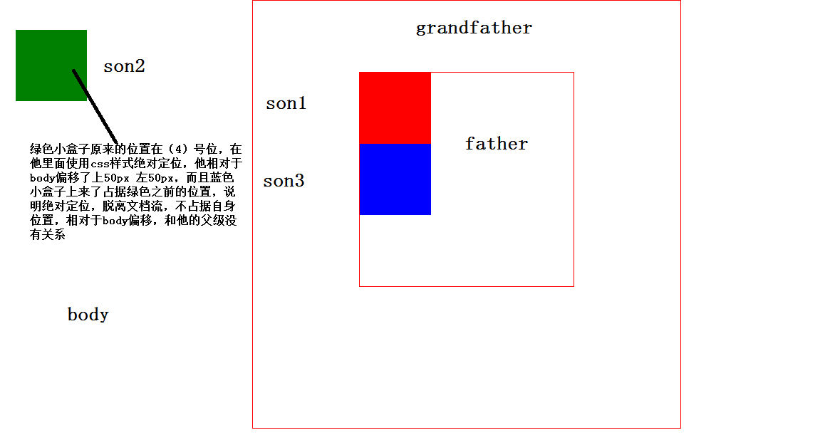
关键字: position:absolute特点:脱离文档流,并且不占有之前的位置,随着页面的左顶点进行位置偏移。
****加粗样式一个简单的例子给大家看看:
一个简单的3x3竖向排列的小块给大家演示一下<!DOCTYPE html><html lang="en"><head><meta charset="UTF-8"><meta name="viewport" content="width=device-width, initial-scale=1.0"><title>Document</title><style> .gfather{ width: 600px; height: 600px; border: 1px solid red; margin: 0 auto; /* position: relative; */ } .father{ width: 300px; height: 300px; border: 1px solid red; margin: 100px auto; /* position: relative; */ } .son1,.son2,.son3{ width: 100px; height: 100px; } .son1{ background-color: red; } .son2{ background-color: green; position: absolute; top: 50px; left: 50px; } .son3{ background-color: blue; /* position: absolute; top: 50px; left: 50px; */ /* right: 50px; */ } </style></head><body><div class="gfather"><div class="father"><div class="son1"></div><div class="son2"></div><div class="son3"></div></div></div></body></html>
图示如下: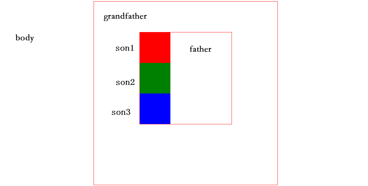
子绝父相布局
就近原则 离谁近就依靠谁的左顶点进行位置偏移,就近在使用父级元素里面使用相对定位,子元素里面就近使用
这里还是用图示的方法给大家展示:
由于代码是一样的,我这边就不一 一赘述了,就是在father父级里面使用相对定位,grandfather里面使用相对定位,子级小绿盒子跟随father进行偏移。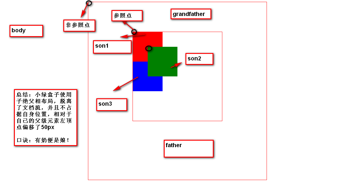
固定定位
1.随页面的左顶点进行偏移
2.脱离文档流,不占用之前位置
3.随页面的左顶点进行偏移(不受父元素影响)一直在一个位置
给大家展示代码:
<!DOCTYPE html><html lang="en"><head><meta charset="UTF-8"><meta name="viewport" content="width=device-width, initial-scale=1.0"><title>Document</title><style> /* .father{ width: 500px; height: 500px; border: 1px solid red; margin: 0 auto; } */ ul li{ list-style: none; width: 80px; height: 40px; background-color: teal; border-top: 1px solid white; text-align: center; line-height: 40px; color: white; /* 改变鼠标样式 pointer 小手的样式 */ cursor: wait; } ul{ /* position: absolute; top: 0px; right: 20px; */ position: fixed; top:100px; } a{ color: white; text-decoration: none; cursor: wait; } </style></head><body><div class="father" id="top"></div>lorem*2000<ul><li>一元抢购</li><li>新品发布</li><li>联系客服</li><li>购物车</li><li>售后服务</li><li><a href="#top">回到顶部</a></li></ul></body></html>
图示如下: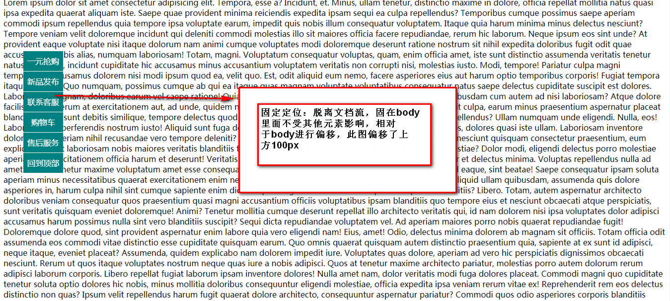
**总结:**想要学好这三种定位布局其实很简单,只需要仔细理解某种定位的特点,结合案例分析练习体会其中的功能和作用即可!
**注意:**三种定位各有优势和缺点,需要将绝对定位和相对定位一起结合使用方可起到很好的作用,固定定位一般用在不需要动的导航条之类的!


 心已赠人
心已赠人 刺骨的言语ヽ痛彻心扉


还没有评论,来说两句吧...