⑥HTML+CSS 定位
定位
- 定位
- 相对定位 ※
- 绝对定位 ※
- 固定定位 ※
- 粘滞定位 ※ (导航条)
- 绝对定位元素的布局
- 元素的层级 z-index ※
本人是个新手,写下博客用于自我复习、自我总结。
如有错误之处,请各位大佬指出。
学习资料来源于:尚硅谷
定位
• position属性可以控制Web浏览器如何以及在何处显示特定的元素。即可以使用position属性把一个元素放置到网页中的任何位置。
• 可选值:
static 默认值,元素是静止的没有开启定位
relative 开启元素的相对定位
absolute 开启元素的绝对定位
fixed 开启元素的固定定位
sticky 开启元素的粘滞定位
相对定位 ※
• 每个元素在页面的文档流中都有一个自然位置。相对于这个位置对元素进行移动就称为相对定位。周围的元素完全不受此影响。
• 当将position属性设置为relative时,则开启了元素的相对定位。
• 当开启了相对定位以后,可以使用top、right、bottom、left四个属性对元素进行定位。
- 相对定位的特点:
1.元素开启相对定位以后,如果不设置偏移量元素不会发生任何的变化
2.相对定位是参照于元素在文档流中的位置进行定位的
3.相对定位会提升元素的层级
4.相对定位不会使元素脱离文档流
5.相对定位不会改变元素的性质块还是块,行内还是行内
例:
<!DOCTYPE html><html lang="en"><head><meta charset="UTF-8"><meta name="viewport" content="width=device-width, initial-scale=1.0"><meta http-equiv="X-UA-Compatible" content="ie=edge"><title>相对定位</title><style> body{ font-size: 60px; } .box1{ width: 200px; height: 200px; background-color: #bfa; } .box2{ width: 200px; height: 200px; background-color: orange; /* 定位(position) - 定位是一种更加高级的布局手段 - 通过定位可以将元素摆放到页面的任意位置 - 使用position属性来设置定位 可选值: static 默认值,元素是静止的没有开启定位 relative 开启元素的相对定位 absolute 开启元素的绝对定位 fixed 开启元素的固定定位 sticky 开启元素的粘滞定位 - 相对定位: - 当元素的position属性值设置为relative时则开启了元素的相对定位 - 相对定位的特点: 1.元素开启相对定位以后,如果不设置偏移量元素不会发生任何的变化 2.相对定位是参照于元素在文档流中的位置进行定位的 3.相对定位会提升元素的层级 4.相对定位不会使元素脱离文档流 5.相对定位不会改变元素的性质块还是块,行内还是行内 - 偏移量(offset) - 当元素开启了定位以后,可以通过偏移量来设置元素的位置 top - 定位元素和定位位置上边的距离 bottom - 定位元素和定位位置下边的距离 - 定位元素垂直方向的位置由top和bottom两个属性来控制 通常情况下我们只会使用其中一 - top值越大,定位元素越向下移动 - bottom值越大,定位元素越向上移动 left - 定位元素和定位位置的左侧距离 right - 定位元素和定位位置的右侧距离 - 定位元素水平方向的位置由left和right两个属性控制 通常情况下只会使用一个 - left越大元素越靠右 - right越大元素越靠左 */ position: relative; left: 100px; top: -200px; } .box3{ width: 200px; height: 200px; background-color: yellow; } </style></head><body><div class="box1">1</div><div class="box2">2</div><div class="box3">3</div></body></html>
效果图:
绝对定位 ※
• 绝对定位指使元素相对于html元素或离他最近的祖先定位元素进行定位。
• 当将position属性设置为absolute时,则开启了元素的绝对定位。
• 当开启了绝对定位以后,可以使用top、right、bottom、left四个属性对元素进行定位。
- 绝对定位的特点:
1.开启绝对定位后,如果不设置偏移量元素的位置不会发生变化
2.开启绝对定位后,元素会从文档流中脱离
3.绝对定位会改变元素的性质,行内变成块,块的宽高被内容撑开
4.绝对定位会使元素提升一个层级
5.绝对定位元素是相对于其包含块进行定位的
例:
<!DOCTYPE html><html lang="en"><head><meta charset="UTF-8"><meta name="viewport" content="width=device-width, initial-scale=1.0"><meta http-equiv="X-UA-Compatible" content="ie=edge"><title>绝对定位</title><style> body{ font-size: 60px; } .box1{ width: 200px; height: 200px; background-color: #bfa; } .box2{ width: 200px; height: 200px; background-color: orange; /* 绝对定位 - 当元素的position属性值设置为absolute时,则开启了元素的绝对定位 - 绝对定位的特点: 1.开启绝对定位后,如果不设置偏移量元素的位置不会发生变化 2.开启绝对定位后,元素会从文档流中脱离 3.绝对定位会改变元素的性质,行内变成块,块的宽高被内容撑开 4.绝对定位会使元素提升一个层级 5.绝对定位元素是相对于其包含块进行定位的 包含块( containing block ) - 正常情况下: 包含块就是离当前元素最近的祖先块元素 - 绝对定位的包含块: 包含块就是离它最近的开启了定位的祖先元素, 如果所有的祖先元素都没有开启定位则根元素就是它的包含块 - html(根元素、初始包含块) */ position: absolute; /* left: 0; top: 0; */ bottom: 0; right: 0; } .box3{ width: 200px; height: 200px; background-color: yellow; } .box4{ width: 400px; height: 400px; background-color: tomato; position: relative; } .box5{ width: 300px; height: 300px; background-color: aliceblue; } </style></head><body><div class="box1">1</div><div class="box4">4<div class="box5">5<div class="box2">2</div></div></div><div class="box3">3</div></body></html>
固定定位 ※
• 固定定位的元素会被锁定在屏幕的某个位置上,当访问者滚动网页时,固定元素会在屏幕上保持不动。
• 当将position属性设置为fixed时,则开启了元素的固定定位。
• 当开启了固定定位以后,可以使用top、right、bottom、left四个属性对元素进行定位。
• 固定定位的其他特性和绝对定位类似。
例:
<!DOCTYPE html><html lang="en"><head><meta charset="UTF-8"><meta name="viewport" content="width=device-width, initial-scale=1.0"><meta http-equiv="X-UA-Compatible" content="ie=edge"><title>固定定位</title><style> body{ font-size: 60px; height: 2000px; } .box1{ width: 200px; height: 200px; background-color: #bfa; } .box2{ width: 200px; height: 200px; background-color: orange; /* 固定定位: - 将元素的position属性设置为fixed则开启了元素的固定定位 - 固定定位也是一种绝对定位,所以固定定位的大部分特点都和绝对定位一样 唯一不同的是固定定位永远参照于浏览器的视口进行定位 固定定位的元素不会随网页的滚动条滚动 */ position: fixed; left: 0; top: 0; } .box3{ width: 200px; height: 200px; background-color: yellow; } .box4{ width: 400px; height: 400px; background-color: tomato; } .box5{ width: 300px; height: 300px; background-color: aliceblue; } </style></head><body><div class="box1">1</div><div class="box4">4<div class="box5">5<div class="box2">2</div></div></div><div class="box3">3</div></body></html>
粘滞定位 ※ (导航条)
<!DOCTYPE html><html lang="en"><head><meta charset="UTF-8"><meta name="viewport" content="width=device-width, initial-scale=1.0"><meta http-equiv="X-UA-Compatible" content="ie=edge"><title>导航条</title><link rel="stylesheet" href="./css/reset.css"><style> body{ height: 3000px; } /* 设置nav的大小 */ .nav{ /* 设置宽度和高度 */ width: 1135px; height: 48px; /* 设置背景颜色 */ background-color: #E8E7E3; /* 居中,同时距上端100px*/ margin:100px auto; /* 粘滞定位 - 当元素的position属性设置为sticky时则开启了元素的粘滞定位 - 粘滞定位和相对定位的特点基本一致, 不同的是粘滞定位可以在元素到达某个位置时将其固定 */ position: sticky; top: 10px; } /* 设置nav中li */ .nav li{ /* 设置li向左浮动,已使菜单横向排列 */ float: left; /* 将文字在父元素中垂直居中 */ line-height: 48px; } /* 设置a的样式 */ .nav a{ /* 将a转换为块元素 */ display: block; /* 去除下划线 */ text-decoration: none; /* 设置字体颜色 */ color: #777777; /* 修改字体大小 */ font-size: 18px; padding: 0 39px; } .nav li:last-child a{ padding: 0 42px 0 41px; } /* 设置鼠标移入的效果 */ .nav a:hover{ background-color: #3F3F3F; color: #E8E7E3; } </style></head><body><!-- 创建导航条的结构 --><ul class="nav"><li><a href="#">HTML/CSS</a></li><li><a href="#">Browser Side</a></li><li><a href="#">Server Side</a></li><li><a href="#">Programming</a></li><li><a href="#">XML</a></li><li><a href="#">Web Building</a></li><li><a href="#">Reference</a></li></ul></body></html>
需要注意的是,有些浏览器是不能使用这种定位的。
绝对定位元素的布局
水平布局:
left + margin-left + border-left + padding-left + width + padding-right + border-right + margin-right + right = 包含块的内容区的宽度
当我们开启了绝对定位后:
水平方向的布局等式就需要添加left 和 right 两个值。
此时规则和之前一样只是多添加了两个值。
当发生过度约束:
如果9个值中没有 auto 则自动调整right值以使等式满足
如果有auto,则自动调整auto的值以使等式满足
可设置auto的值:margin width left right
因为left 和 right的值默认是auto,所以如果不指定left和right。则等式不满足时,会自动调整这两个值
垂直方向布局的等式的也必须要满足:
top + margin-top/bottom + padding-top/bottom + border-top/bottom + height = 包含块的高度
<!DOCTYPE html><html lang="en"><head><meta charset="UTF-8"><meta name="viewport" content="width=device-width, initial-scale=1.0"><meta http-equiv="X-UA-Compatible" content="ie=edge"><title>绝对定位元素的布局</title><style> .box1{ width: 500px; height: 500px; background-color: #bfa; position: relative; } .box2{ width: 100px; height: 100px; background-color: orange; position: absolute; margin: auto; /* 水平布局 left + margin-left + border-left + padding-left + width + padding-right + border-right + margin-right + right = 包含块的内容区的宽度 - 当我们开启了绝对定位后: 水平方向的布局等式就需要添加left 和 right 两个值 此时规则和之前一样只是多添加了两个值: 当发生过度约束: 如果9个值中没有 auto 则自动调整right值以使等式满足 如果有auto,则自动调整auto的值以使等式满足 - 可设置auto的值 margin width left right - 因为left 和 right的值默认是auto,所以如果不指定left和right 则等式不满足时,会自动调整这两个值 垂直方向布局的等式的也必须要满足 top + margin-top/bottom + padding-top/bottom + border-top/bottom + height = 包含块的高度 */ left: 0; right: 0; top: 0; bottom: 0; } </style></head><body><div class="box1"><div class="box2"></div></div></body></html>
元素的层级 z-index ※
• 当元素开启定位以后就可以设置z-index这个属性。
• 这个属性可以提升定位元素所在的层级。
• z-index可以指定一个整数作为参数,值越大元素显示的优先级越高,也就是z-index值较大的元素会显示在网页的最上层。
例:
<!DOCTYPE html><html lang="en"><head><meta charset="UTF-8"><meta name="viewport" content="width=device-width, initial-scale=1.0"><meta http-equiv="X-UA-Compatible" content="ie=edge"><title>元素的层级</title><style> body{ font-size: 60px; } .box1{ width: 200px; height: 200px; background-color: #bfa; position: absolute; /* 对于开启了定位元素,可以通过z-index属性来指定元素的层级 z-index需要一个整数作为参数,值越大元素的层级越高 元素的层级越高越优先显示 如果元素的层级一样,则优先显示靠下的元素 祖先的元素的层级再高也不会盖住后代元素 */ z-index: 2; } .box2{ width: 200px; height: 200px; background-color: rgba(255 , 0, 0, .3); position: absolute; top: 50px; left: 50px; z-index: 3; } .box3{ width: 200px; height: 200px; background-color: yellow; position: absolute; top: 100px; left: 100px; z-index: 3; } .box4{ width: 100px; height: 100px; background-color: orange; position: absolute; } </style></head><body><div class="box1">1</div><div class="box2">2</div><div class="box3">3<div class="box4">4</div></div></body></html>
如果类box1层级为2的效果图: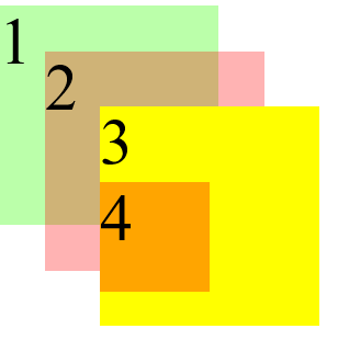
如果类box1层级为4的效果图: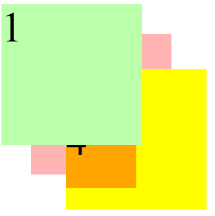
祖先的元素的层级再高也不会盖住后代元素。也就是说就算类box3层级再高,也不会覆盖类box4.


 拼搏现实的明天。
 刺骨的言语ヽ痛彻心扉
 超、凢脫俗
超、凢脫俗


还没有评论,来说两句吧...